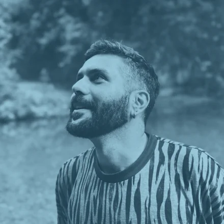
Hi, I'm Francesco, a Digital & Service Design Lead focused on turning complexity into clear, human-centred experiences.
For over 15 years, I've designed products and services across different industries, from luxury and telecommunications to humanitarian programmes with the World Food Programme.
My work spans research, strategy, service design, UX and delivery, always starting with people and the realities behind their needs.
Outside of work, I'm passionate about visual design, painting, music and digital storytelling, creative interests that continue to shape the way I think and design.
(05) Approach
"I design the invisible thread between users and services."
My approach begins with listening, questioning assumptions and looking beyond what happens on the screen. I connect people's needs with organisational realities, turning fragmented interactions and complex systems into services that feel coherent, intuitive and human.
Service DesignUX ResearchDesign StrategyDigital Transformation
People before processes
I begin by understanding the people involved, their needs, behaviours and the context surrounding them.
From insight to implementation
I connect research, strategy and design to turn evidence into services that can work in the real world.
Designed for the whole system
I look beyond individual touchpoints to align user needs, operational realities and organisational goals.
Experience
(06) 2011-2026
2023-2026
Digital & Service Design Lead
World Food Programme (WFP) · Rome
Service design and UX research from WFP HQ, supporting humanitarian cash-assistance and food-security programmes across country offices worldwide.
2020-2023
Graphic & Digital Design Expert
World Food Programme (WFP) · Rome
Project management, art direction and digital design for WFP's Cash-Based Transfer (CBT) division, turning complex processes into intuitive, digitally-oriented solutions.
2016-2020
Senior Consultant, UX / UI Design
Reply · Rome & Milan
UX/UI design for 20+ brands across luxury, telecoms, finance and healthcare, Prada, Miu Miu, TIM, Luxottica, UnipolSai, Generali and Intesa Sanpaolo.
2011-2016
Art Director & Graphic Designer
Filas · G. Fiorucci · Freelance · Rome
Brand identity, art direction and graphic design across multiple clients and agencies.
(07) Contact
Let's work together.
Available for senior design roles, consulting and advisory.
The work shown was produced in my roles at the World Food Programme and Reply, on behalf of the respective organisations and clients. All names, logos and trademarks belong to their owners and appear for portfolio purposes only.
All work
WFP · Government of Grenada · 2025
Redesigning social protection in Grenada.
End-to-end service design engagement with the Government of Grenada, mapping, analysing, and reimagining how cash assistance reaches the most vulnerable.
Service DesignProcess MappingGap AnalysisGov. AdvisoryDigital Strategy
Process maps · Gap analysis · User journeys · Digital blueprint
2
programmes fully mapped
69
days, max process time
38+
process steps documented
6
systemic gaps identified
The challenge, process complexity
A 69-day chain to reach one family.
69 days and 38+ steps across four phases stand between one family and their first payment. The width of each phase is its real duration.
Application
4steps
Day 0–9 · 9 days
Data & eligibility
9steps
Day 9–26 · 17 days
Payment list
15steps
Day 26–40 · 14 days
Distribution
10+steps
Day 40–69 · 29 days
Day 0 · application submittedDay 69 · cash in hand
Today, SEED process
Manual / paper
82%
Digital
18%
Target, after redesign
Manual / paper
20%
Digital
80%
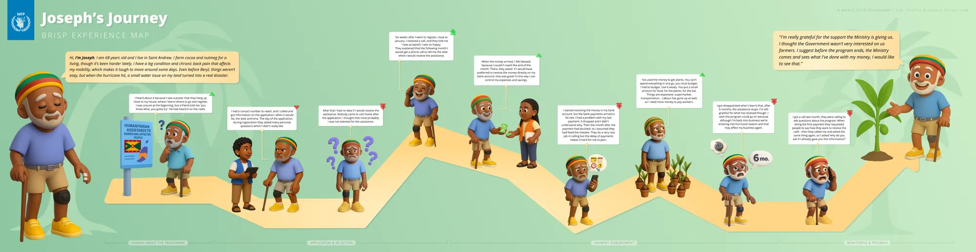
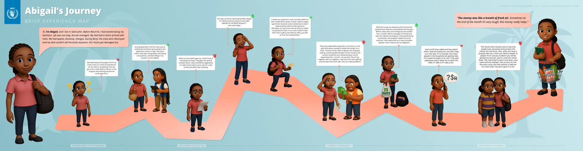
User research, beneficiary journeys
Two people. Two stories. The same broken system.
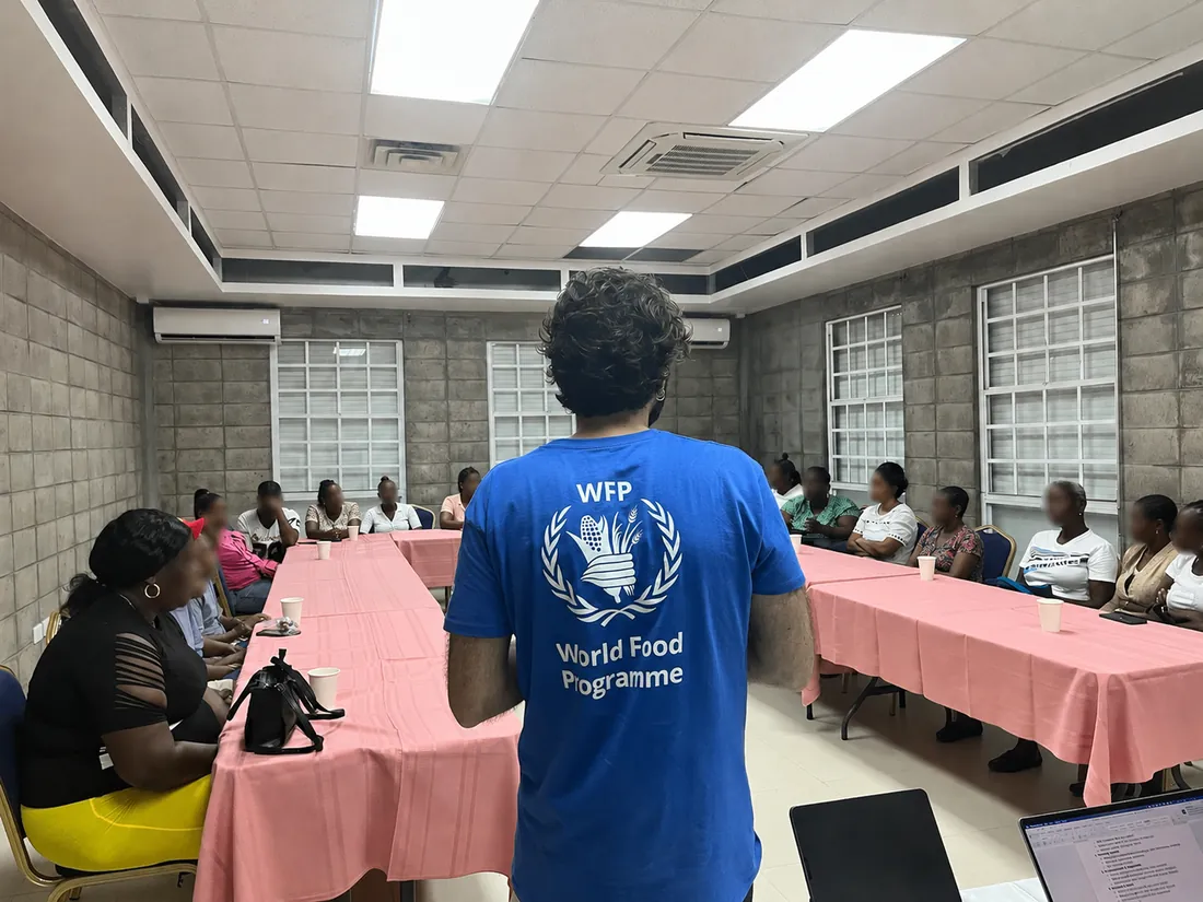
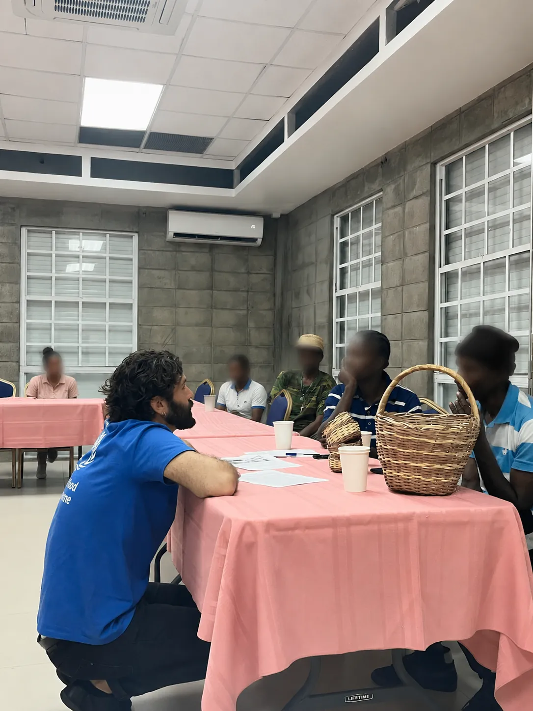
Focus group with the people the programmes serveGrenada · 2025 · their words became the journeys below
Listening at the tableWhat the programmes feel like from their side, and where the government could do better
PrivacyFaces are obscured to protect the privacy of the people who took part.
Joseph's journey68 · cocoa farmer · Saint Andrew · BRISP · scroll sideways, click to zoom
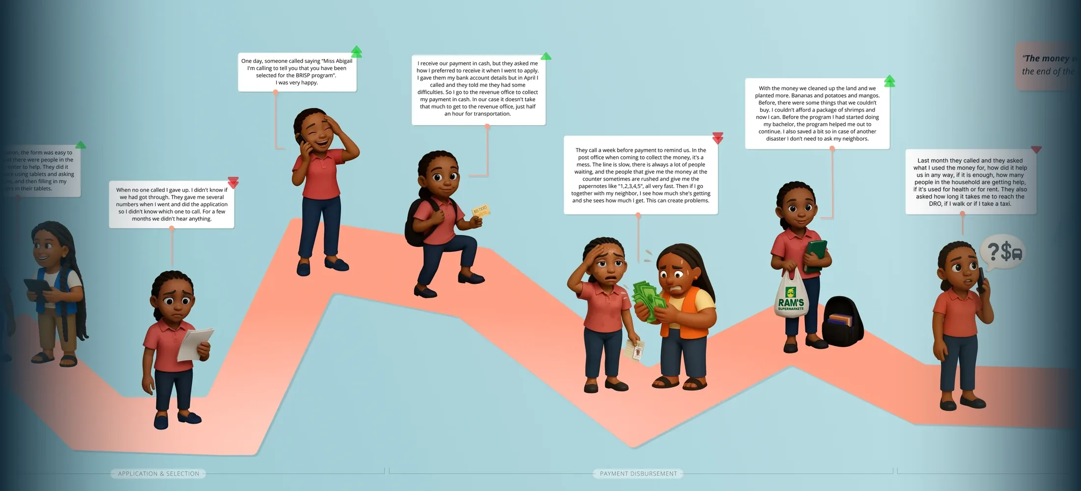
Abigail's journeyearly 20s · student · Saint John · BRISP · scroll sideways, click to zoom
Note: Joseph and Abigail are composite research personas. Names and personal details are illustrative, synthesised from field interviews to represent real beneficiary groups rather than identifiable individuals.
Gap analysis
Six systemic gaps. All fixable.
69
Process time
Up to 69 days application to payment. 82% manual steps.
Critical
0
Digital audit trail
Sensitive paysheets couriered by hand. No encryption.
Critical
0%
Non-selected notified
Zero communication to rejected applicants. They wait for months.
High
2
Islands excluded
Carriacou and Petite Martinique have zero SEED coverage.
Medium
4×
Approval loops
90-page paysheets re-printed for every error. Four manual stages.
High
0
Exit strategy
No link between assistance and livelihood programmes.
Medium
Recommendations
Four pillars for lasting change.
01
Digital transformation
Mobile data collection, e-signatures, automated SMS, digital audit trails. From 69 days to near-real-time.
KoBoToolboxSMS automationE-signatures
02
Assurance & controls
Data protection protocols, FSP reconciliation, digital paysheet transmission.
Data privacyFSP reconciliation
03
Maximise existing tools
BMIS has case management, but staff barely use it. Capacity building before new investment.
BMIS adoptionStaff training
04
Coverage & exit strategy
Expand to Carriacou and Petite Martinique. Link SEED to livelihoods.
Island expansionLivelihood link
Impact
Why this work matters.
2
national programmes fully mapped
38+
process steps documented
6
systemic gaps identified & addressed
50+
people interviewed beneficiaries & ministry staff
Placeholder“
A short testimonial from the people behind this project will appear here.
··
Full name
Ministry of Social Development · Government of Grenada
Led the recreation of HungerMap end to end, as Product Manager and UX/UI design lead: one platform serving two audiences, the general public (donors, governments, media) and WFP experts (VAM Officers, Country Office colleagues), balancing WFP's brand with Google.org donor requirements.
External: donors, governments, media · Internal: VAM Officers, CO colleagues
Timeline
Jul 2024 → Oct 2025
2
audiences one platform
2
brand identities balanced
5
thematic data areas
3
countries tested
The real challenge, missing data
You can't map hunger with empty widgets.
The old HungerMap had a structural flaw: it often showed nothing. Every country office produces its own mix of data and uploads only what it needs locally, so when office capacity lagged, whole countries and widgets came up blank, on a platform whose entire job is to show where hunger is worst.
How we solved it, across data, product and design
01 · At the data level
A baseline that's always populated
Working directly with VAM officers in each country and the data scientists and analysts at HQ, we defined a data-level key so a core set of indicators is always present, closing the information holes.
02 · At the product level
Every widget can be switched on or off
External and internal widgets are fully customizable and toggleable, so data teams and developers surface only the widgets that actually hold data. The platform never shows an empty box.
03 · At the design level
A public view built on people, not figures
With the same VAM and HQ data teams, we chose a storytelling approach for the external audience, always centring on the people in need rather than raw numbers.
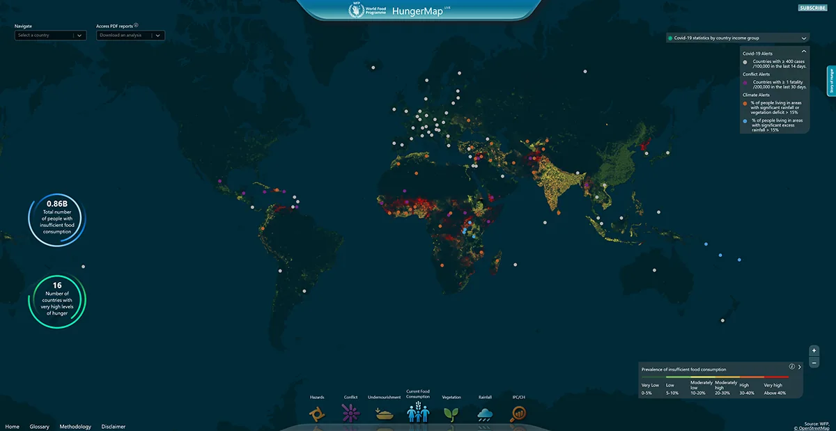
The redesign, before / after
One platform, rebuilt. Drag to compare.
Before · HungerMap LIVEAfter · HungerMap 2.0
Drag the handle, or use arrow keys, to compare the two homepagesMy role, product + design
From product strategy to design direction.
Product
Product Manager
Product roadmap, feature prioritisation, KPIs and success metrics
Cross-functional alignment between WFP, Google and development teams
Risk management, testing strategy and hand-over to development
Research
UX Research Lead
Workshops with country officers in Nigeria, Yemen, Cameroon
Critical user journeys for two distinct audiences
UX highlights report and workshop summary
Design
UX/UI Design Lead
Led UI production of both platform versions in Figma
Visual system balancing WFP brand + Google.org requirements
Directed the final UI & DataViz phase with a dedicated UI designer and Google design partners
The new platform, real screens
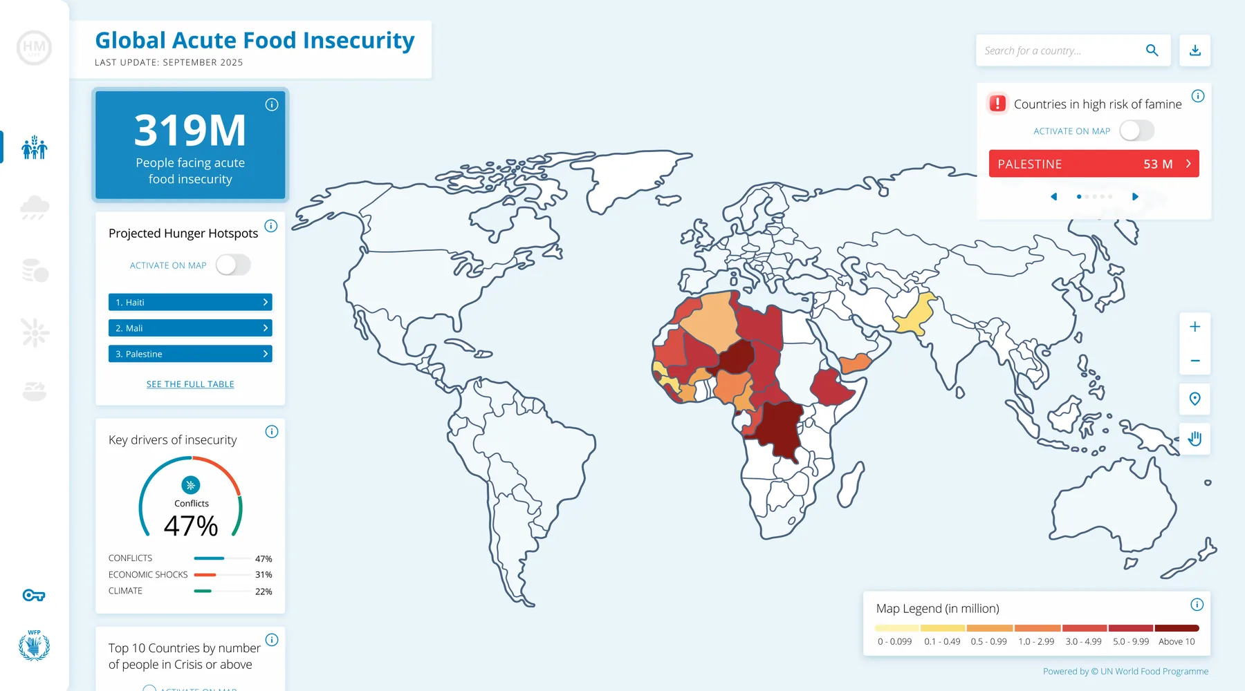
From one dense dashboard to a guided, thematic platform.
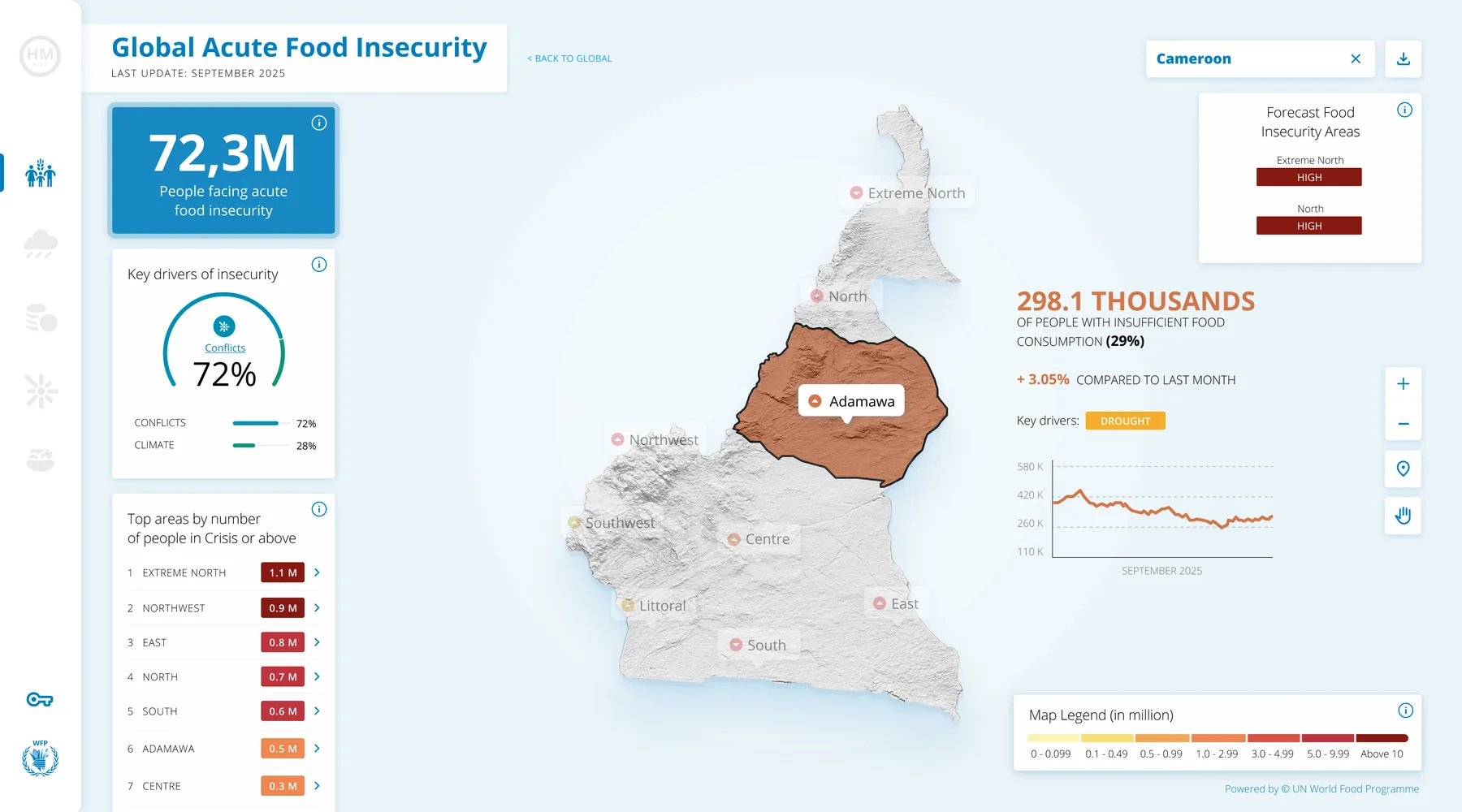
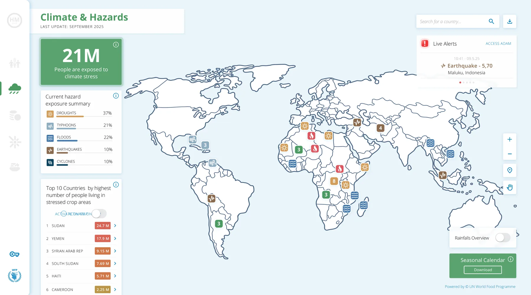
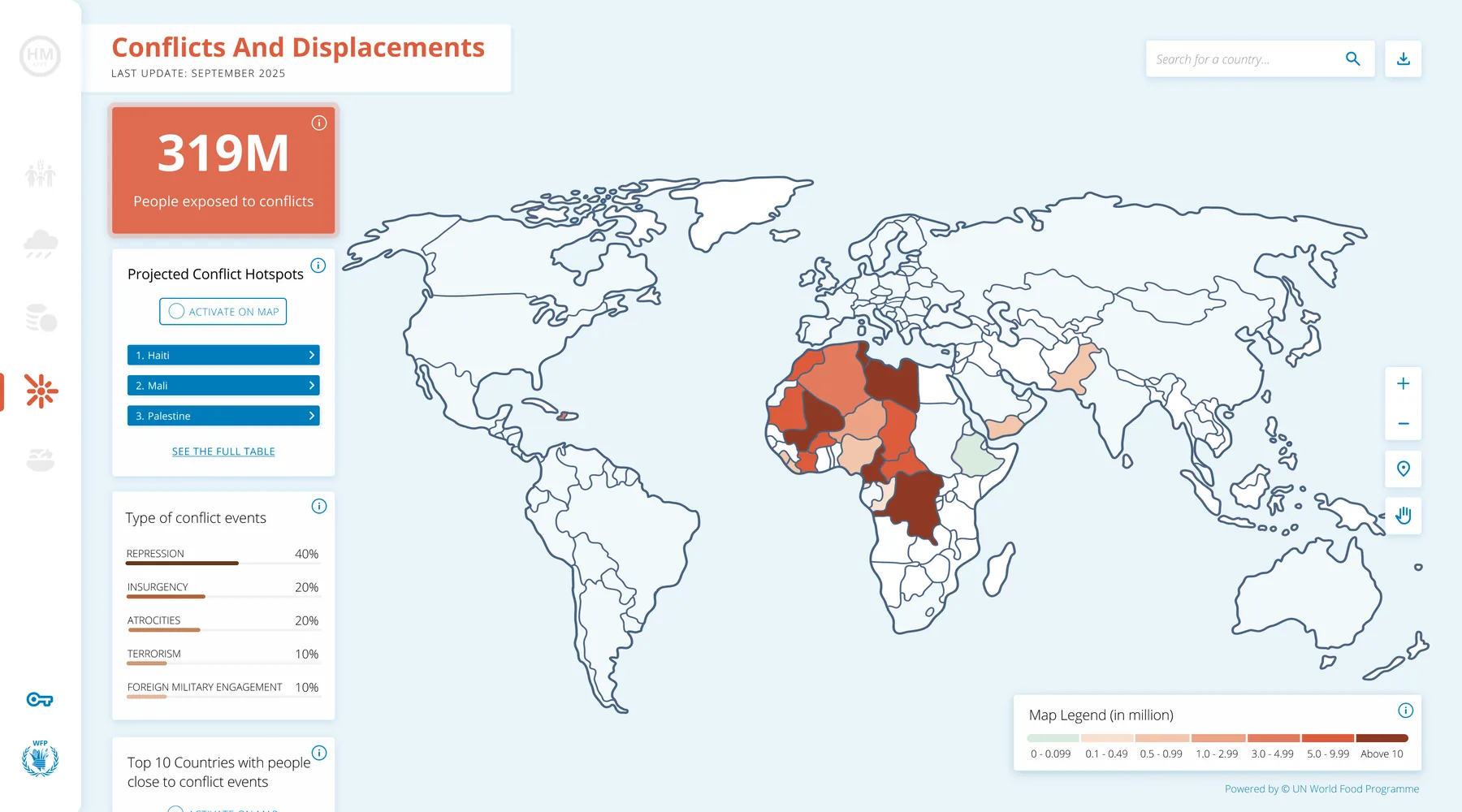
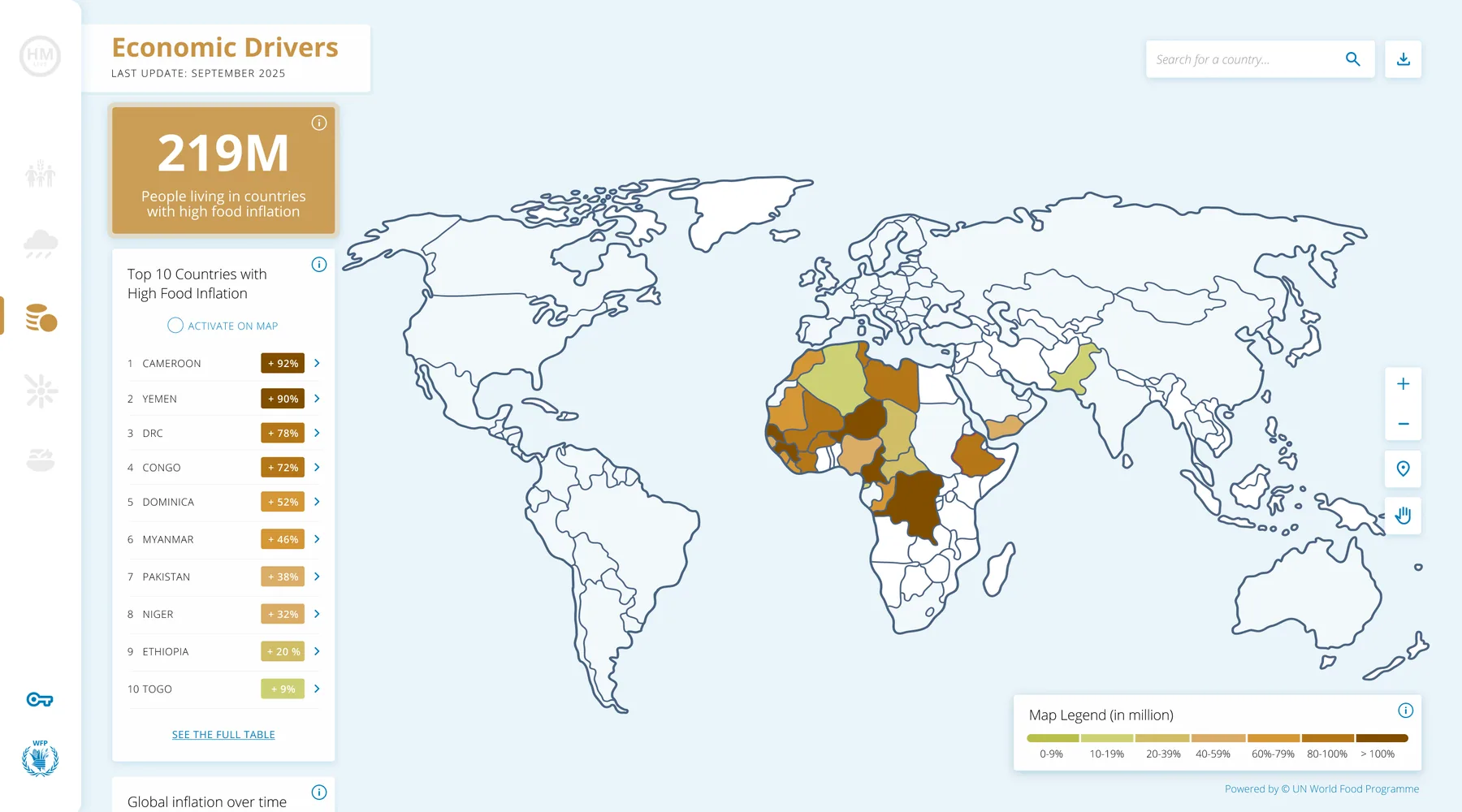
One clear headline metric, five thematic areas (food security, nutrition, climate, conflict, economy), and drill-down from global to region level. These are the actual screens: scroll the strip sideways, click any screen to zoom.
After · Food security, globalOne headline metric, drivers and hotspots at a glance
After · Country drill-downRegion-level data + forecast
After · Climate & hazardsLive alerts, hazard exposure
After · Conflicts & displacementsProjected conflict hotspots
After · Economic driversFood inflation, ranked and mapped
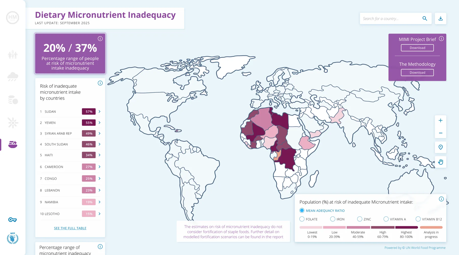
After · Nutrition, globalMicronutrient inadequacy by country
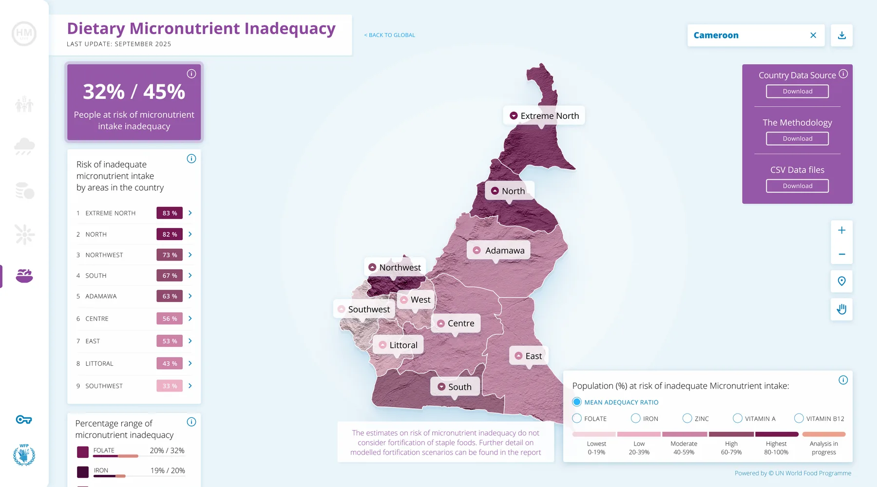
After · Nutrition, countryRegion-level nutrient breakdown
Scroll, drag or use the arrows to explore →
Design demonstration. All figures, countries and rankings shown are placeholder data used to illustrate the interface, not real WFP operational data.
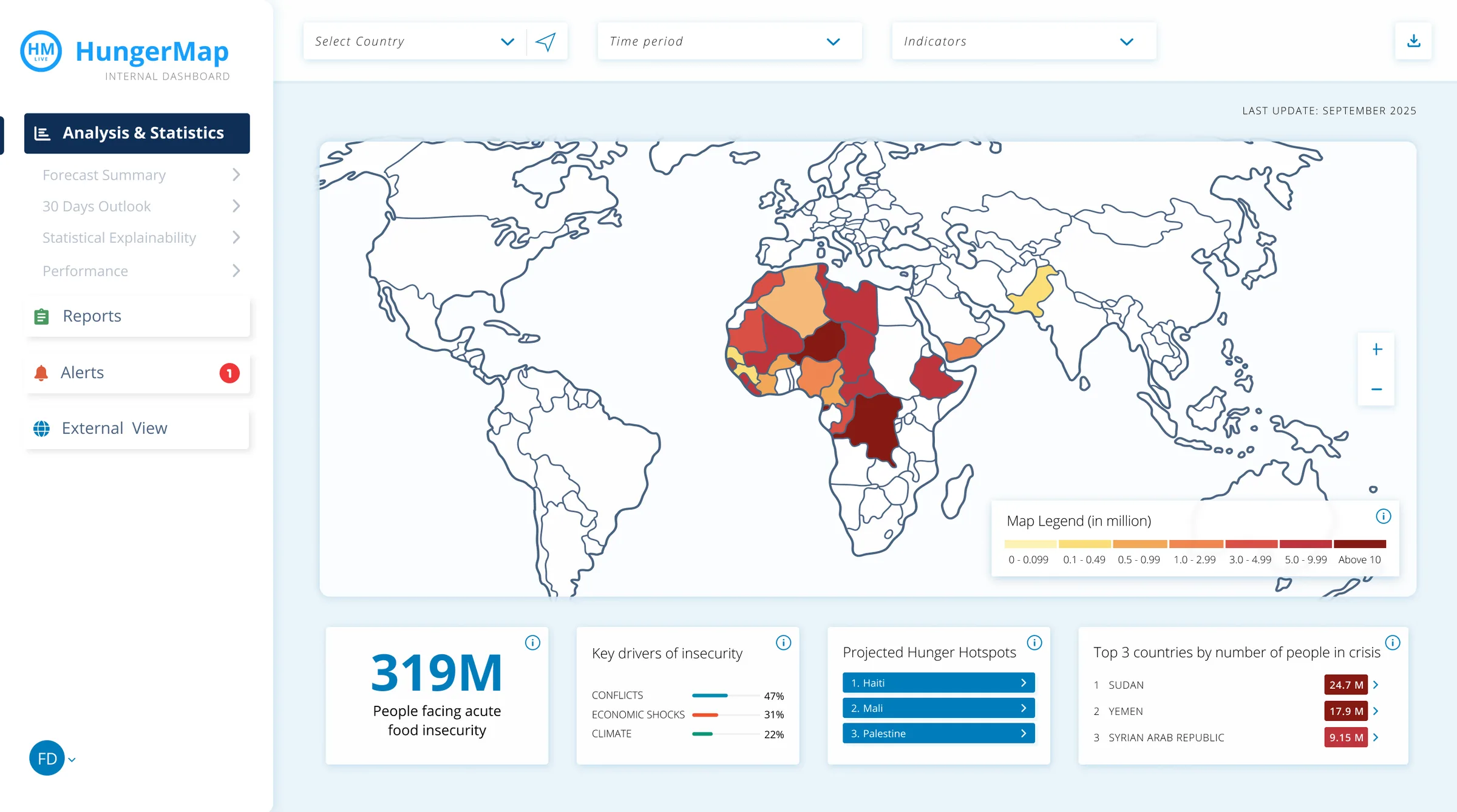
After · Internal dashboard, work in progressForecasts, alerts and reports for WFP analysts
Same data backbone, expert tooling: forecast summary, 30-day outlook, statistical explainability
Alerts and reports in one place
One click to the external view
Access restricted. The internal dashboard is available to WFP staff only.
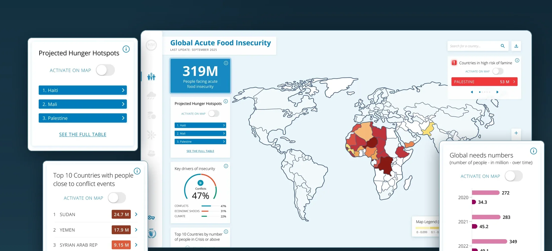
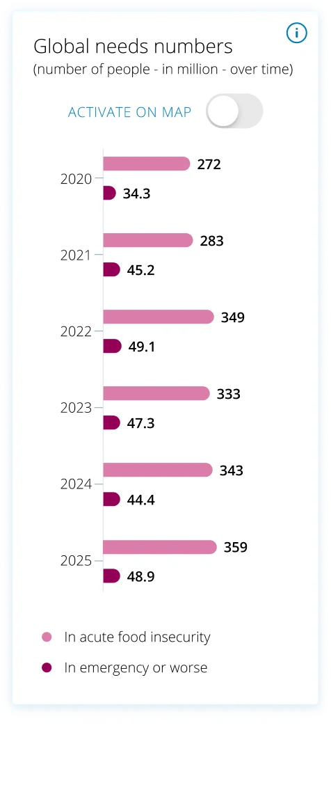
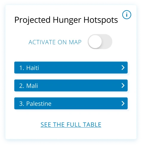
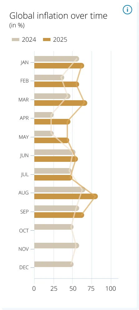
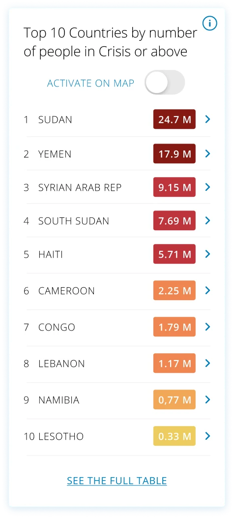
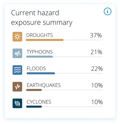
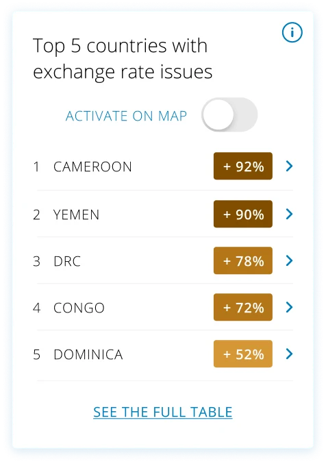
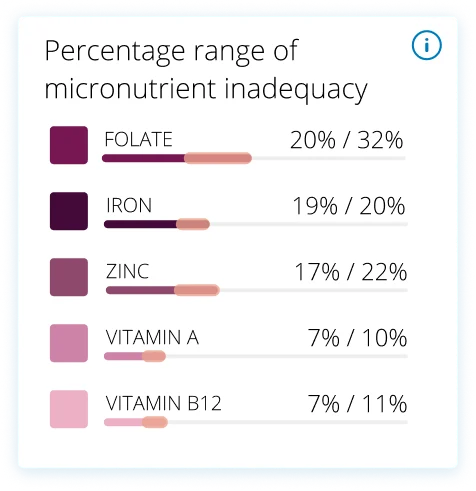
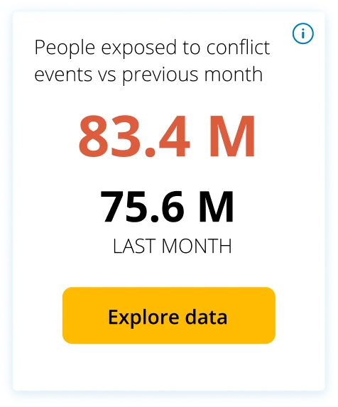
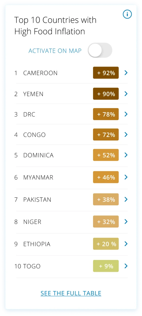
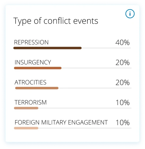
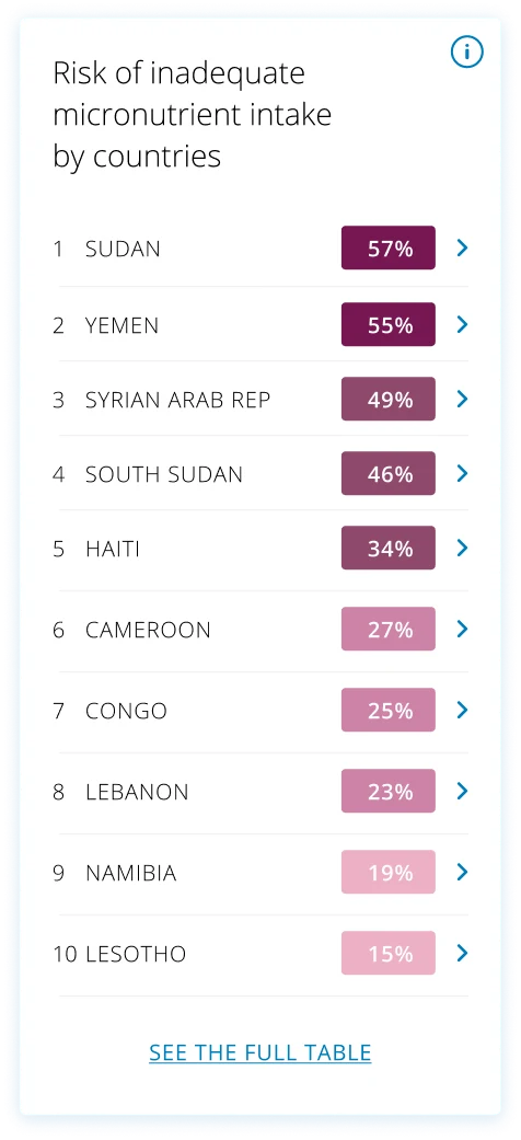
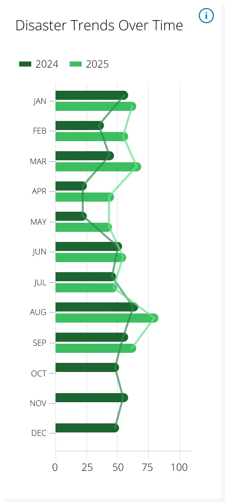
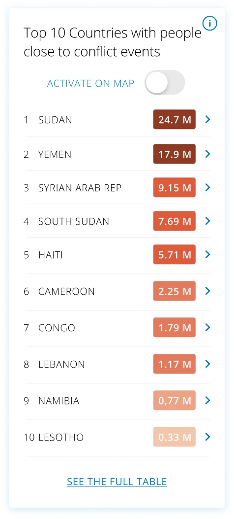
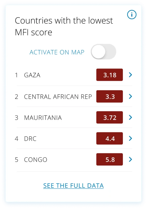
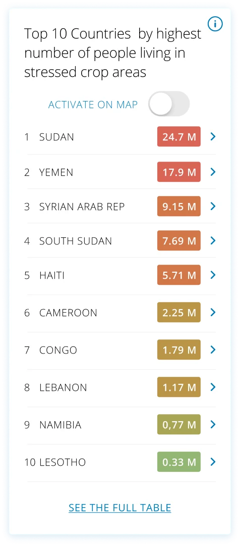
Data visualisation, rebuilt widget by widget.
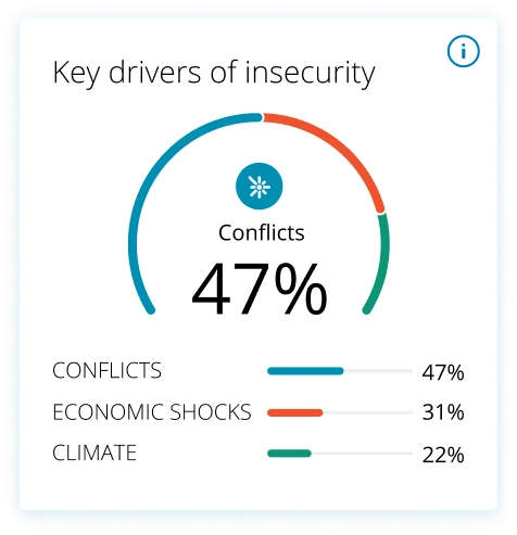
Every indicator became a modular card with one job: rankings, drivers, trends, hotspots. Hover to pause the flow, click any widget to zoom.
Each widget is fully customizable and can be switched on or off, so only the ones populated with real data are ever shown, no empty boxes. Many also carry an Activate on map toggle: switch it on and the widget's dataset overlays the world map as a live, interactive layer, rankings, hotspots and needs you can explore geographically.
Design demonstration. The values inside these widgets are placeholder data for design purposes only, not real WFP figures.
Live platform
See the HungerMap this redesign builds on.
The current HungerMap LIVE is public and running today, while 2.0 moves through development.
One flat map becomes two UX layers, storytelling for donors and governments, precision tools for VAM Officers and CO colleagues.
02
Reactive → Predictive
Old: current state only. New: 30-day AI forecasting was designed to help WFP anticipate emerging risks and support earlier decision-making.
03
Country-only → Admin L0→L4
From national overview to village-level drill-down. VAM Officers can now plan interventions with district precision instead of regional averages.
04
Static → Live contextual layers
Conflict, rainfall, and market price overlays let VAM Officers understand why FCS is declining, not just that it is, enabling smarter, faster decisions.
Process, 2024 → 2025
From workshops to development hand-off.
1
Jul – Dec 2024
Workshops & dual-audience architecture
Facilitated workshops with country officers in Yemen, Nigeria, and Cameroon. Defined the dual-audience architecture, confirmed MVP features and Google.org requirements.
UX Research, critical user journeys for both audiences
Mapped the distinct needs and mental models of both audiences. For the external audience: how do donors and governments go from awareness to action? For VAM Officers: how do they move from data to a resource allocation decision in under 2 minutes?
UX researchCritical user journeysUX highlights report
3
Jan – Feb 2025
UI design leadership, Figma production
Led the UI production of both platform versions: visual system respecting WFP brand and Google.org requirements, typography, data visualisation colours, component library, admin drill-down interactions.
Directed the finalisation of the interface with a dedicated UI & DataViz designer and Google design partners: interactive behaviour, data presentation logic, and the design hand-off to front-end development.
Field testing surfaced a clear pattern: every country office needs a different mix of data for its own assistance programmes. That validated the customizable, toggleable dashboard, country teams found it necessary and valued being able to shape their own view rather than fight a one-size-fits-all screen.
Why it matters
A hunger map built to prevent, not just report.
Global
public access for donors, governments & media
30-day
AI forecasting with Google.org, for earlier action
Custom
dashboards each country office can shape
Zero
empty widgets, core data always populated
Placeholder“
A short testimonial from the people behind this project will appear here.
··
Full name
HungerMap team · WFP HQ
Next case study
People Portal, a form everyone can use.
All work
WFP Innovation Accelerator · Supply Chain, Identity Management · Digital & Service Design Lead · 2024
People Portal, a form everyone can use.
UI and UX for WFP's People Portal, a mobile-first platform where people in crisis self-register for assistance from their own phone, designed to work for every level of digital literacy, together with the internal portal WFP and NGO colleagues use to build their country registration forms.
People-facing portal + internal form-builder for staff
2M+
people registered remotely
$9.4M
operational costs saved
96%
cost cut per household $12 → $0.50
3
active crises deployed
The challenge
Register the hardest-to-reach, from a phone.
In an emergency, registering people in person is slow, costly and often impossible, and fake, cloned registration pages put already-vulnerable people at risk. The portal had to let anyone enrol remotely, safely, and in low connectivity. The harder design problem: one form that works for everyone, from the highly digital to someone filling in an online form for the very first time.
Three constraints shaped every decision
01 · Access
In-person didn't scale
Queues, staff and offices can't keep pace with the speed and size of a crisis. People needed to register from their own phone, wherever they were.
02 · Trust & safety
Cloned pages, real risk
Fraudulent look-alike pages exploited people in need. The real portal had to be unmistakably WFP, secure and duplicate-proof.
03 · Everyone
Every level of digital literacy
The same form had to be usable by someone confident online and by someone who had never filled one, on any device, in their own language.
The core of the work, accessible forms
One form, for every level of digital literacy.
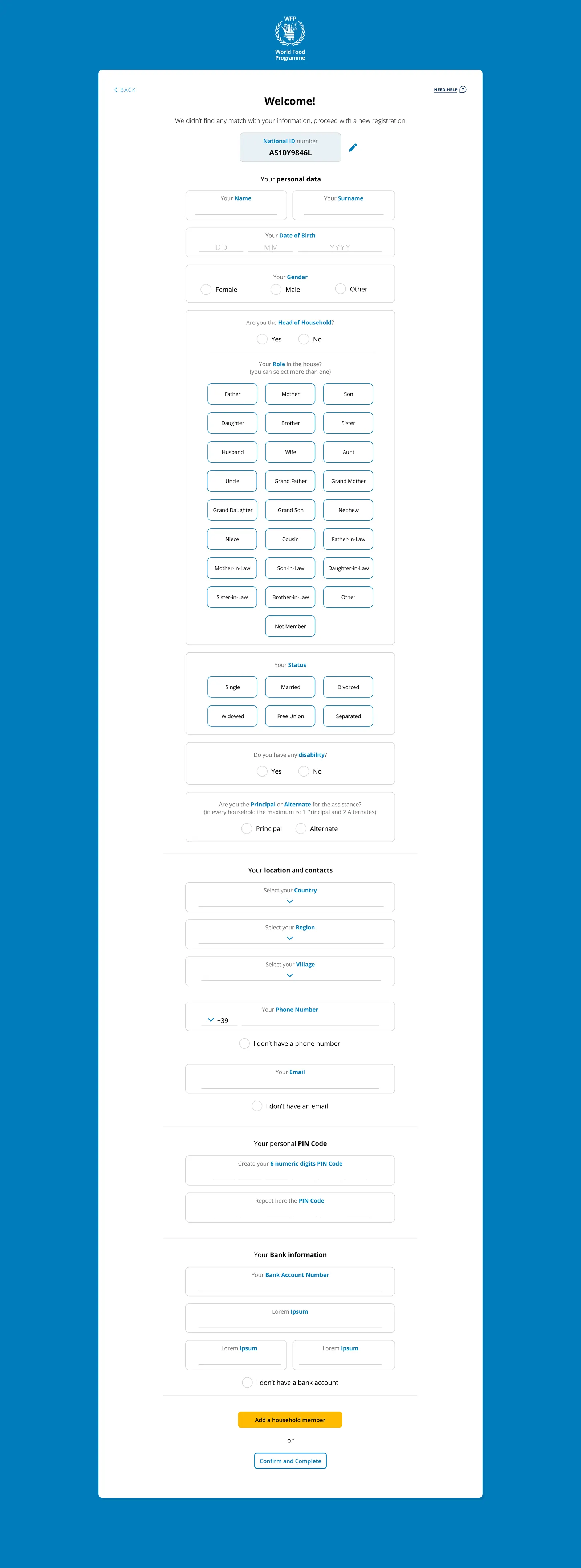
Registration is one long, high-stakes form: name, household, roles, location, identity, bank details. I studied and tested how to make it fillable by anyone, and rebuilt it around choices instead of typing, honest "I don't have this" paths, and constant guidance, so nothing about a person's situation could lock them out.
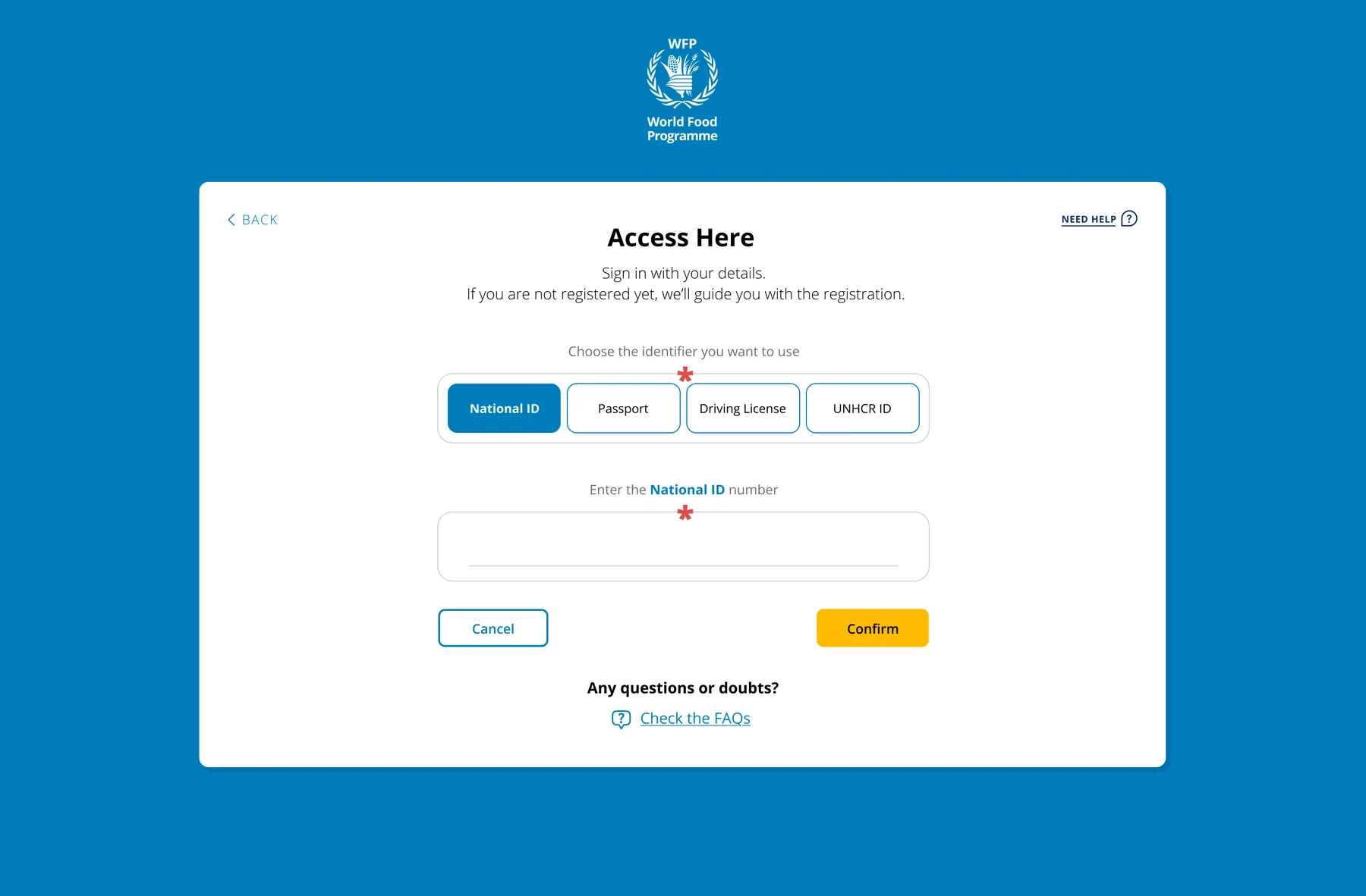
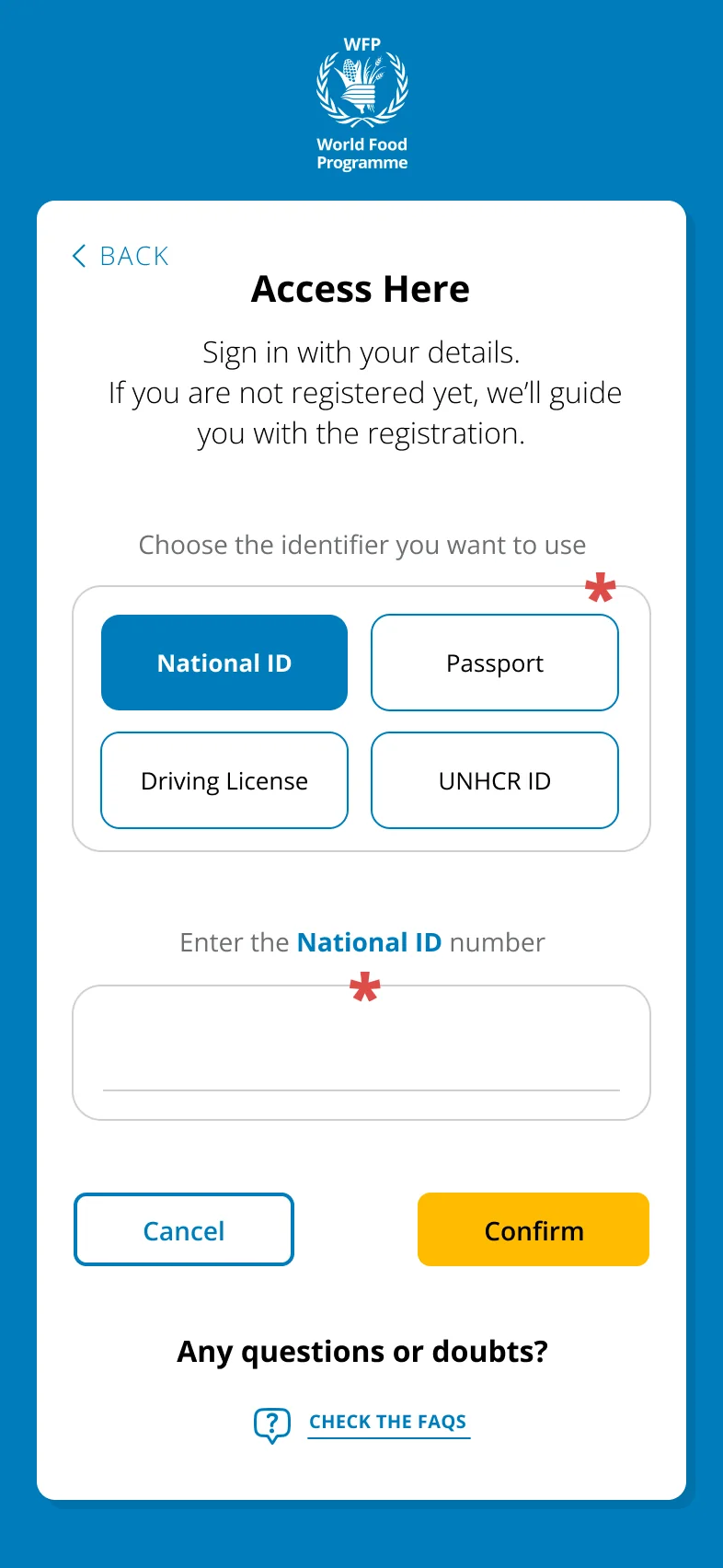
Identity, your way
Four ways to identify yourself
National ID, passport, driving licence or UNHCR ID, so displaced and undocumented people are never turned away.
Tap, don't type
Family roles as buttons
Household roles and status are tappable options, not free text, removing spelling, language and keyboard barriers.
No wrong answer
"I don't have a phone / email / bank account"
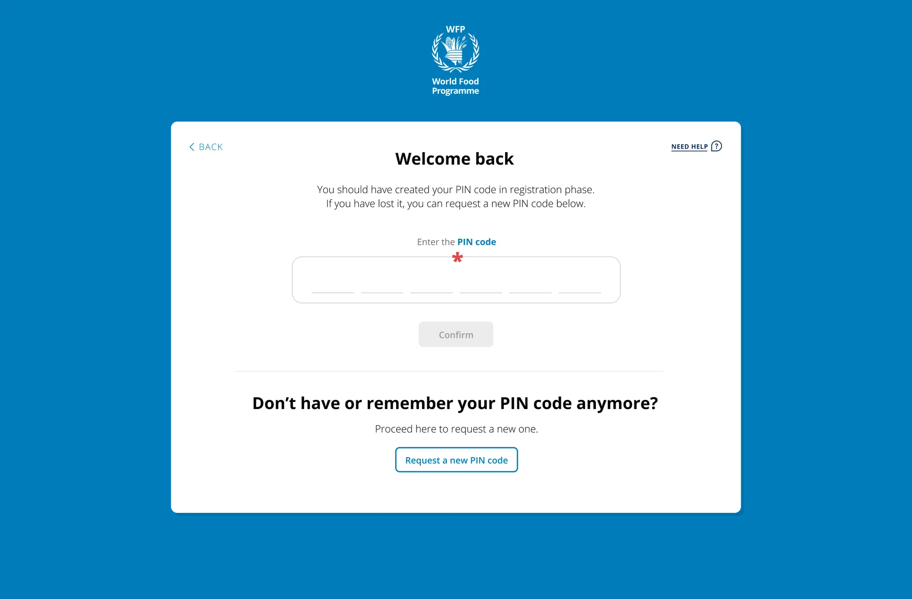
Explicit paths for people with no phone, email or bank account, plus a simple 6-digit PIN instead of passwords.
WFP People Portal · registration
The full registration form, scroll inside the frame, or click to open it full-screen. All data shown is placeholder.
The people-facing portal, real screens
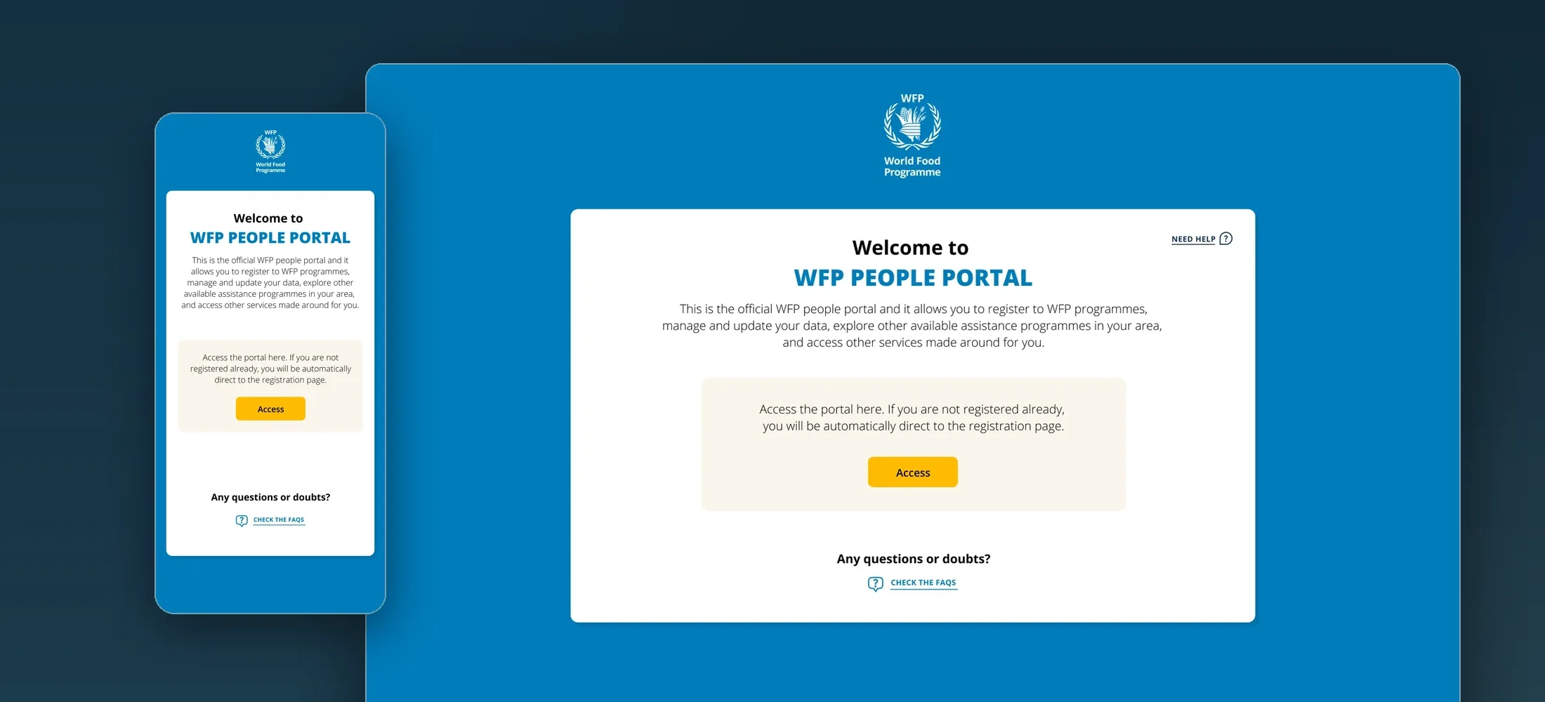
From welcome to registered, in a guided flow.
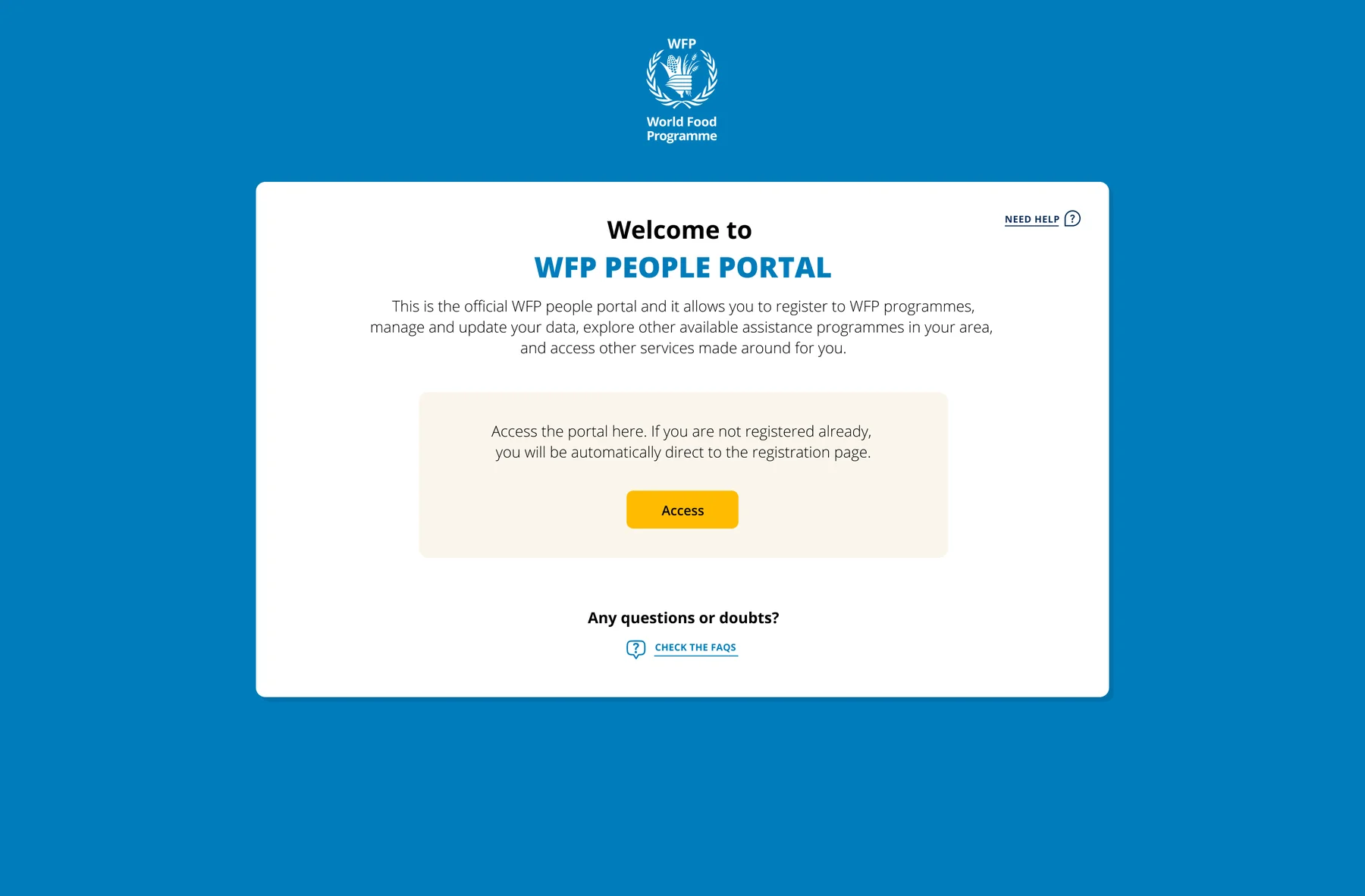
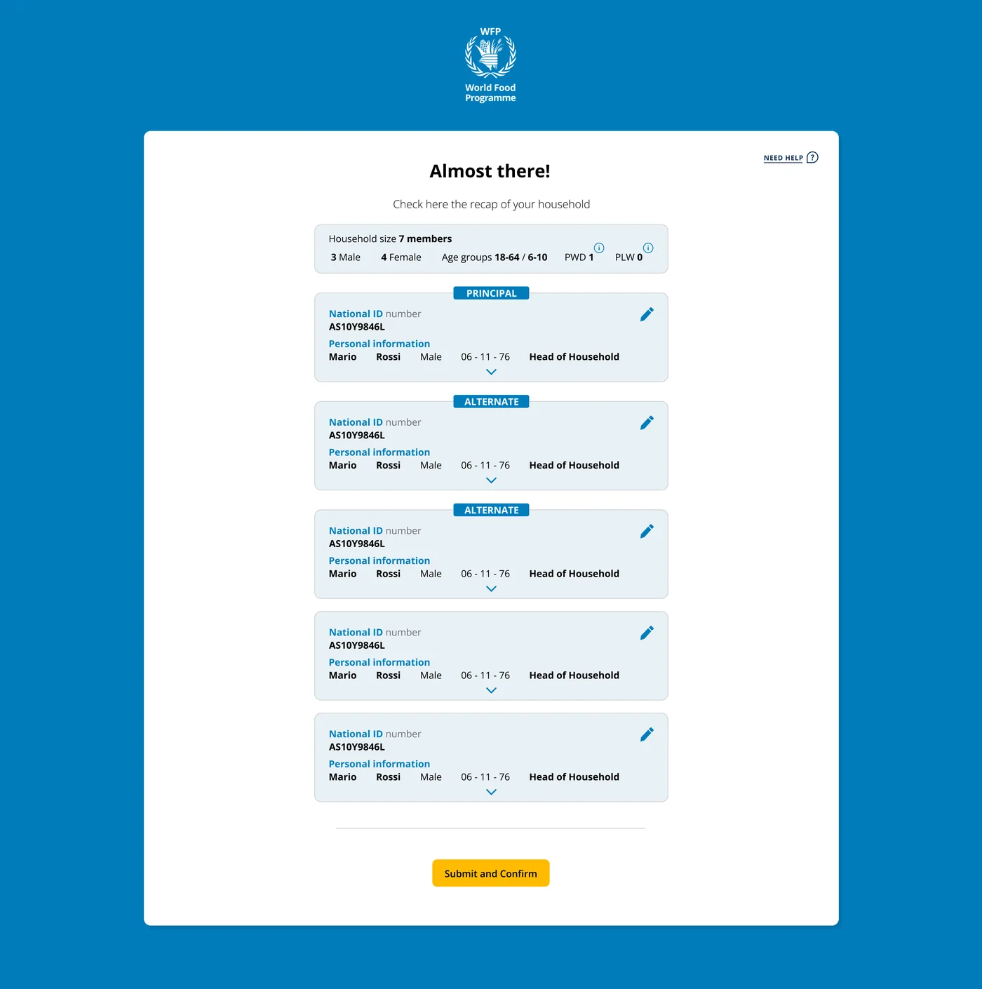
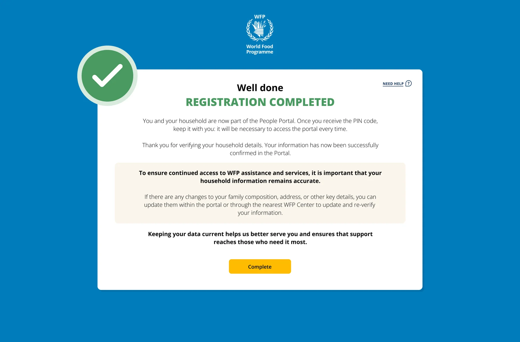
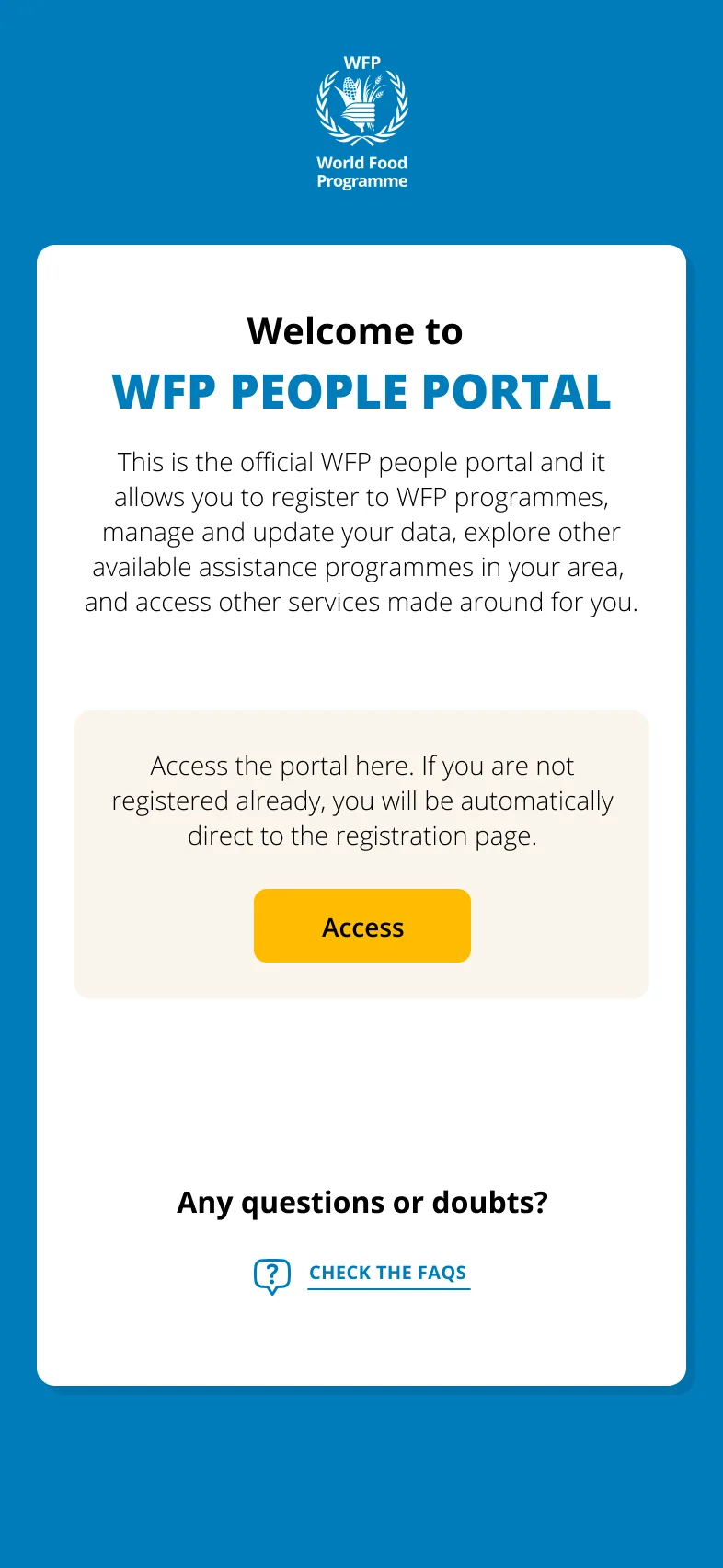
A calm, step-by-step journey: a clear welcome, choose how to identify yourself, a simple PIN instead of passwords, a household recap to check, and a reassuring confirmation. Scroll the strip, click any screen to zoom.
WelcomeOfficial WFP entry point
Identify yourselfFour document types
Simple PINNo passwords
Household recapCheck before submit
RegisteredClear confirmation
Scroll, drag or use the arrows to explore →
Design demonstration. All names, IDs and figures shown are placeholder data, not real people.
Mobile-first, and consent by design
Built for the phone in someone's hand.
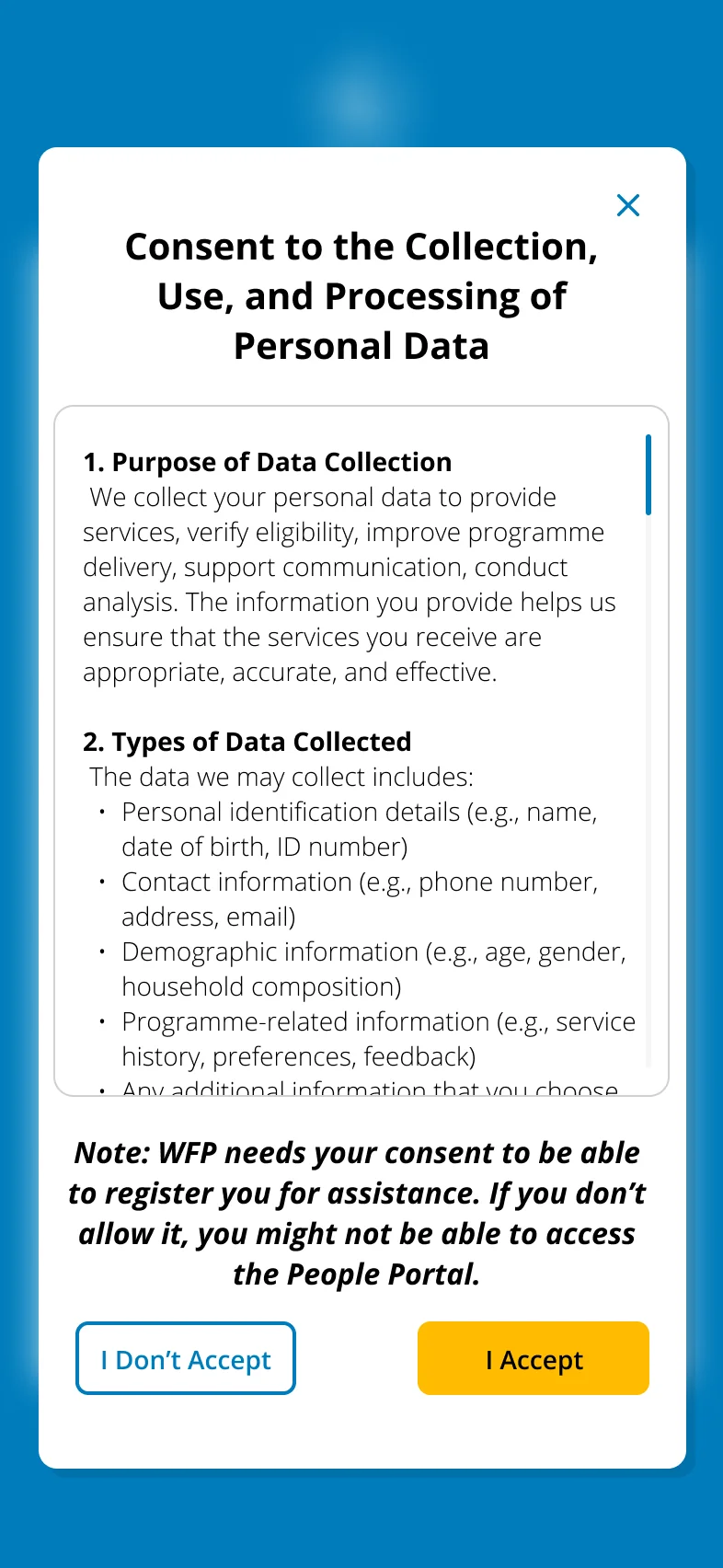
Most people register on a phone, often a shared or basic one, so every screen is mobile-first, and before anything is collected people give explicit, plain-language consent over how their data is used.
Mobile welcome
Identify yourself
Explicit data consent
From emergency response to product
Born in an emergency, in Gaza.
The People Portal began as the Self Registration App (SRA), built fast to answer the emergency in Gaza, families registered the moment they needed it, often by scanning a QR code at a distribution point. As the response matured, SRA grew into the People Portal, adding a registered-user space to update location, bank and payment details, manage household members and apply to newly eligible programmes.
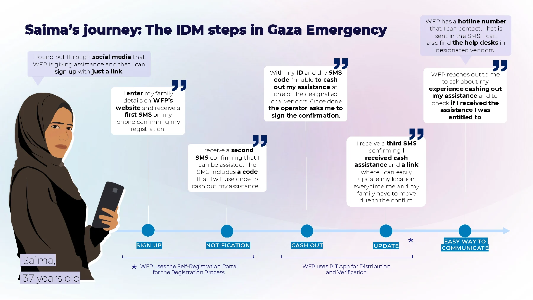
Saima's journey, the SRA registration and cash-out steps in the Gaza emergency (persona illustration).
English
Arabic
Field guidance for the Self Registration App, how to update your location when displaced. Shared on WFP's channels, shown muted and looping.
Two portals, one clear system
I designed both sides of the form.
A registration form is only as good as the tool used to build it. Beyond the people-facing portal, I designed the internal portal WFP and partner NGO colleagues use to create and adapt their own registration forms in each country, so a form can be stood up fast in a new emergency and stays clear and consistent for everyone: the people registering, the staff assisting, and the partners on the ground.
For people
The People Portal
The public, mobile-first experience where people in need register and manage their household.
For colleagues
The form-builder portal
The internal tool where WFP and NGO teams compose and adapt their country's registration forms.
One language
Consistency end to end
Shared components and rules keep both sides coherent, fewer errors, faster setup in a new country.
Confidential. The internal admin interface and the People Portal's registered-user area can't be shown here.
Impact
Registration that reaches millions, for cents.
2M+
people registered remotely
$9.4M
operational costs saved to date
$0.50
per household, down from $12
$115M
potential yearly saving at scale
Placeholder“
A short testimonial from the people behind this project will appear here.
··
Full name
Supply Chain, Identity Management · WFP
Next case study
Designing for dignity in crisis.
All work
WFP · Multi-country Research · 2023–2024
Designing for dignity in crisis.
User journey maps for WFP's Cash-Based Transfer programmes, field research across 5 countries in active crisis, designing for people who are illiterate, elderly, undocumented, or fleeing conflict.
Service Design ResearchUser Journey MappingHumanitarianInclusive Design
User journey maps · Pathway to Digital Financial Inclusion framework
5
countries in active crisis
6
lived experiences mapped
1
strategic framework
Millions
of beneficiaries served by the programmes
The challenge, designing at the extremes
Designing when access, trust and safety cannot be taken for granted.
WFP's Cash-Based Transfer programmes reach millions of people, but the experience of receiving that assistance was invisible. I mapped it, in five countries, through the eyes of the people living it. The constraint: every design decision had to work for users who may be illiterate, without a smartphone, without documents, or in an active conflict zone.
S
Saima, 37
Gaza
3rd displacement. Has a phone and passport. Navigating cash assistance during active conflict.
F
Fawziye, 76
Lebanon
Cannot read or write. Depends on family. Mobility issues. $65/month is her only income.
R
Rasha, 35
Lebanon
Literate, helps neighbours register. Anxious about SMS timing. Helps others navigate the system.
H
Hana
Jordan
Mother of 4 in a community project. New to mobile money, worried about fees and using a wallet.
A
Aamiina
Somalia
No smartphone of her own. Uses husband's phone. Registered in husband's name by mistake.
D
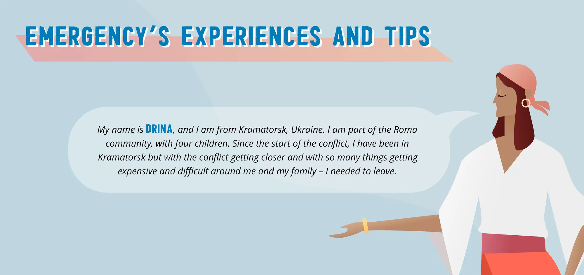
Drina
Ukraine
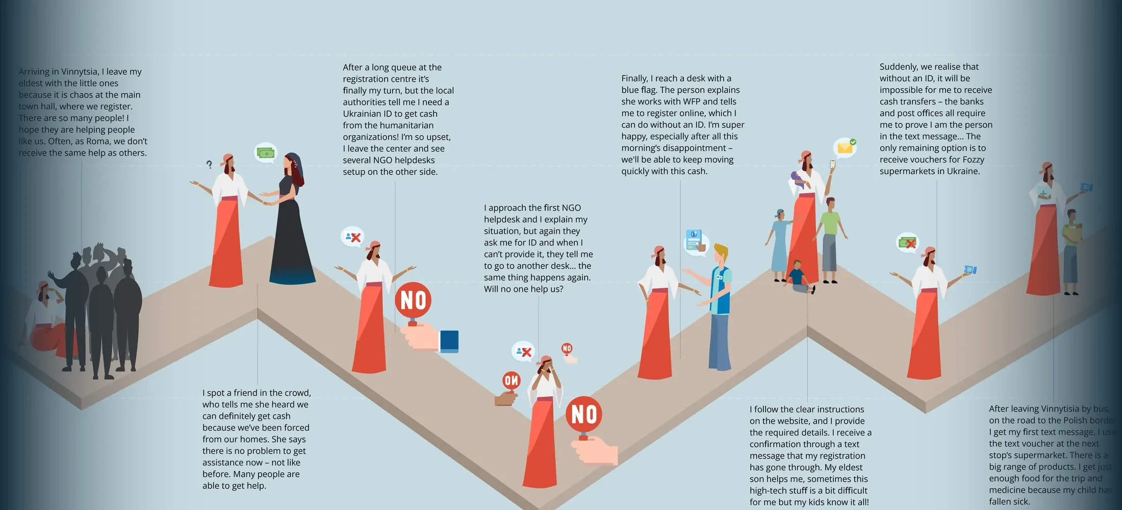
Roma community. No official ID. Denied help 3 times before WFP found a solution without ID.
Note: these are composite research personas. Names and personal details are illustrative, synthesised from field interviews across five countries to represent real beneficiary groups rather than identifiable individuals.
Field research, journey maps
Their experience, told in their words.
S
Saima, 37, Gaza
IDM steps · Emergency CBT programme
Sign upNotificationCash outUpdateSupport
Found WFP via social media, registered with just a link
Received SMS confirmation + unique cash-out code
Cashed out at local vendor using ID and SMS code
Can update her location via link each time she moves
"I found out through social media that WFP is giving assistance and I can sign up with just a link."
Digital financial inclusion, two journeys
From a shared phone in Somalia to a wallet of her own in Jordan.
The same research method, applied in two very different mobile money contexts. Each journey surfaced findings that shaped how WFP designs digital payments for women.
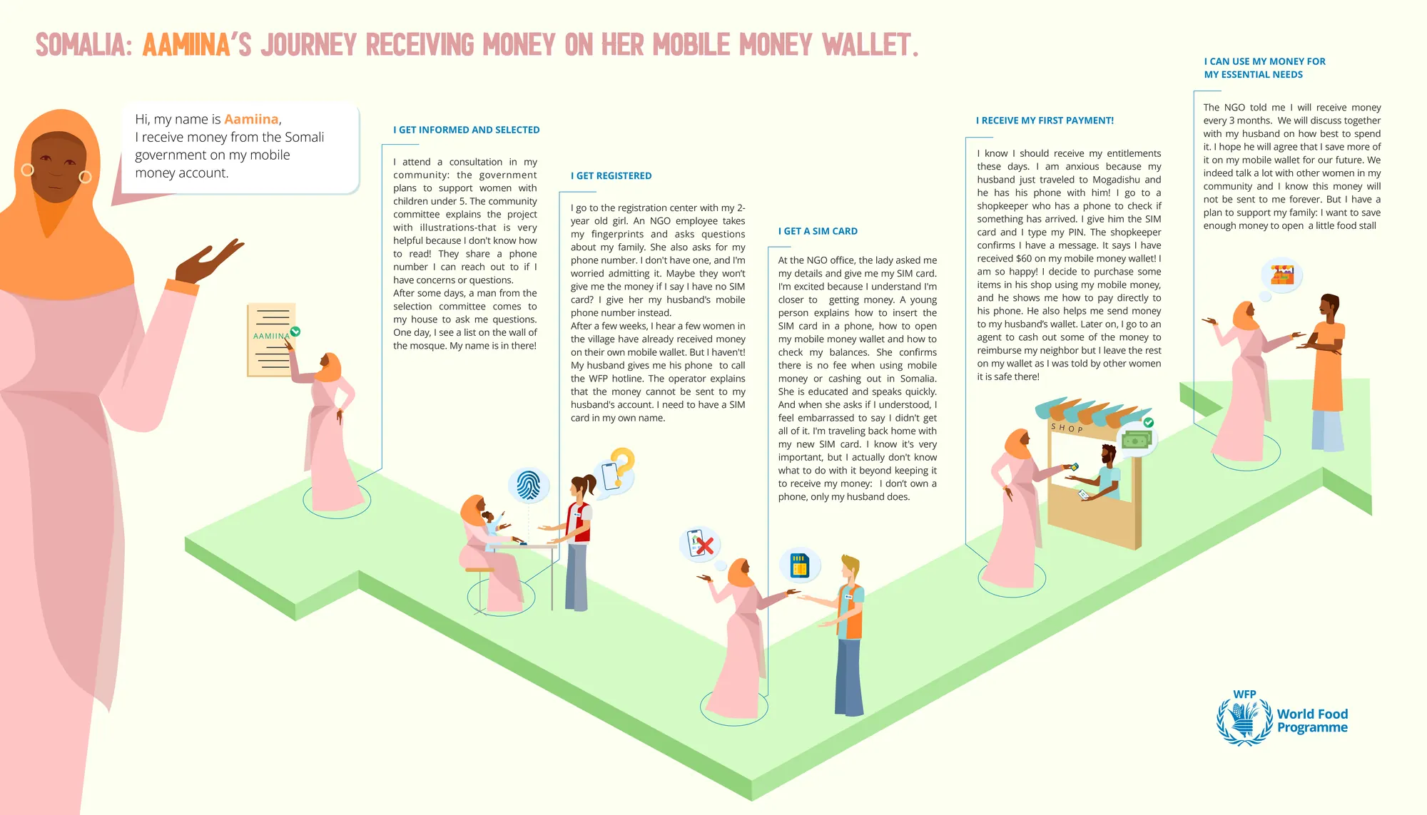
Aamiina's journeySomalia · government support on a mobile wallet · click to zoom
The list on the mosque wall. Selection was announced where the community already looks, and illustrated sessions worked for people who cannot read.
Payments cannot go to a husband's SIM. Aamiina needed a card in her own name, so getting women their own SIM became part of the service.
The shopkeeper is the interface. Checking messages, cashing out and paying all pass through trusted humans, not through the app alone.
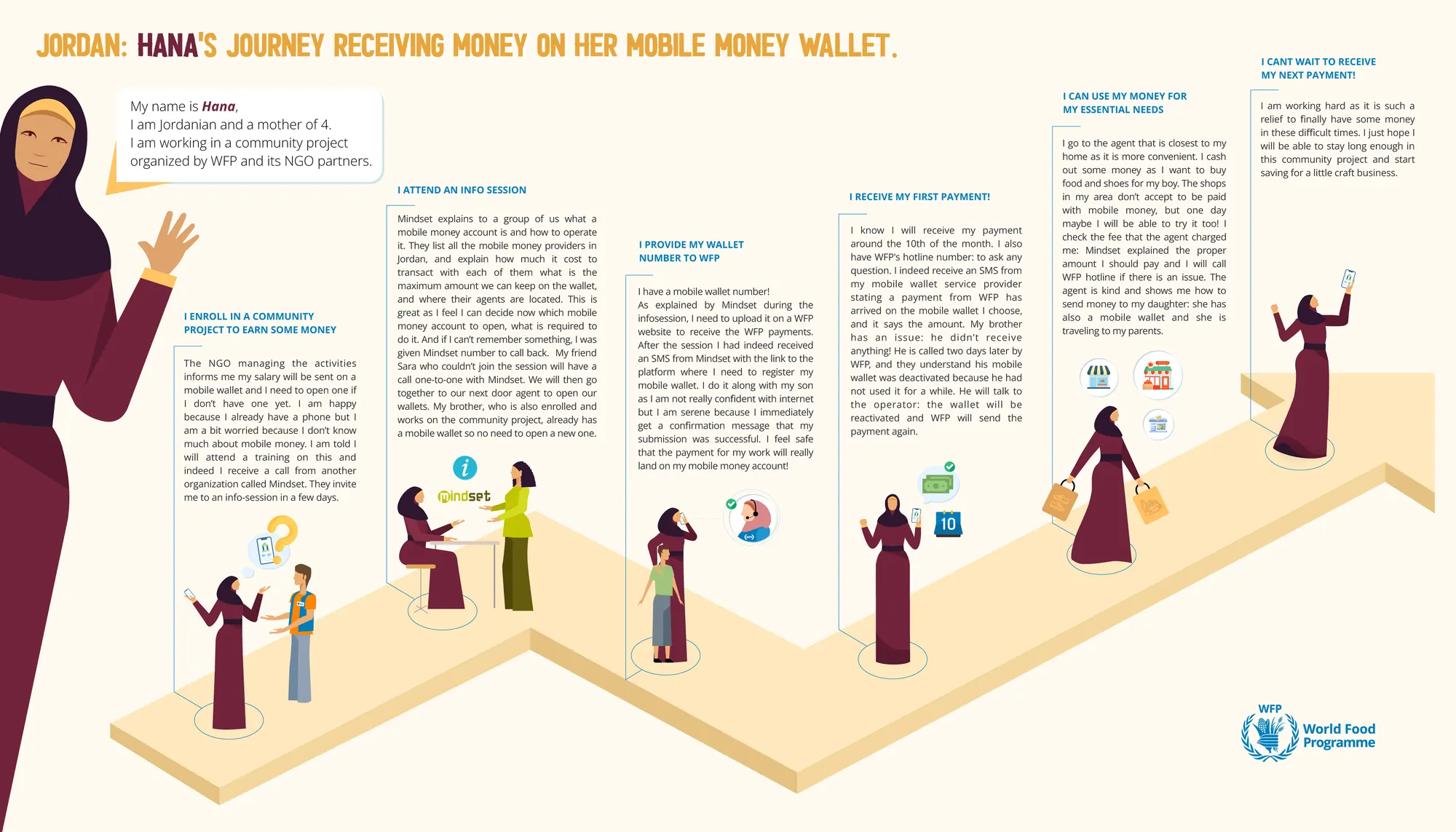
Hana's journeyJordan · a community project salary on a mobile wallet · click to zoom
Info sessions turn worry into confidence. After one session Hana could compare providers, fees and limits, and chose her own wallet.
Dormant wallets are a real failure path. Her brother's payment bounced because his unused wallet had been deactivated, reactivation had to be designed for.
Agents work, shops do not yet. Cash-out is easy nearby, but local shops still refuse mobile money, the last mile of acceptance is the next problem.
Emergency response, Ukraine
Drina's story, from Kramatorsk to a voucher that worked.
1 / 3
Design principles, what this research taught us
Six rules for designing in extreme contexts.
1
Design for the margin
If it works for someone who cannot read, walk far or own a phone, it works for everyone. Design for the hardest case first.
2
Communicate proactively
Waiting without news erodes trust faster than bad news. Confirm every step, even when nothing has changed.
3
No ID ≠ No cash
People fleeing rarely carry documents. Every service needs a pathway that works without official identification.
4
Proxy access matters
Phones, literacy and mobility are often shared family resources. Design for use through someone the person trusts.
5
Dignity in disbursement
How money is handed over matters as much as how much. Privacy at the cash point is not a luxury.
6
Offline-first always
Connectivity, devices and electricity come and go. The service must keep its promise when the network does not.
Impact
Designing for programmes that reach millions.
5
countries in active crisis
6
lived experiences from the field
Global
framework adopted by WFP CBT teams
Real
every insight from field interviews
Placeholder“
A short testimonial from the people behind this project will appear here.
··
Full name
Cash-Based Transfers division · WFP
Next case study
CashBook App, field operations tool.
All work
WFP · Internal Product Design · 2024
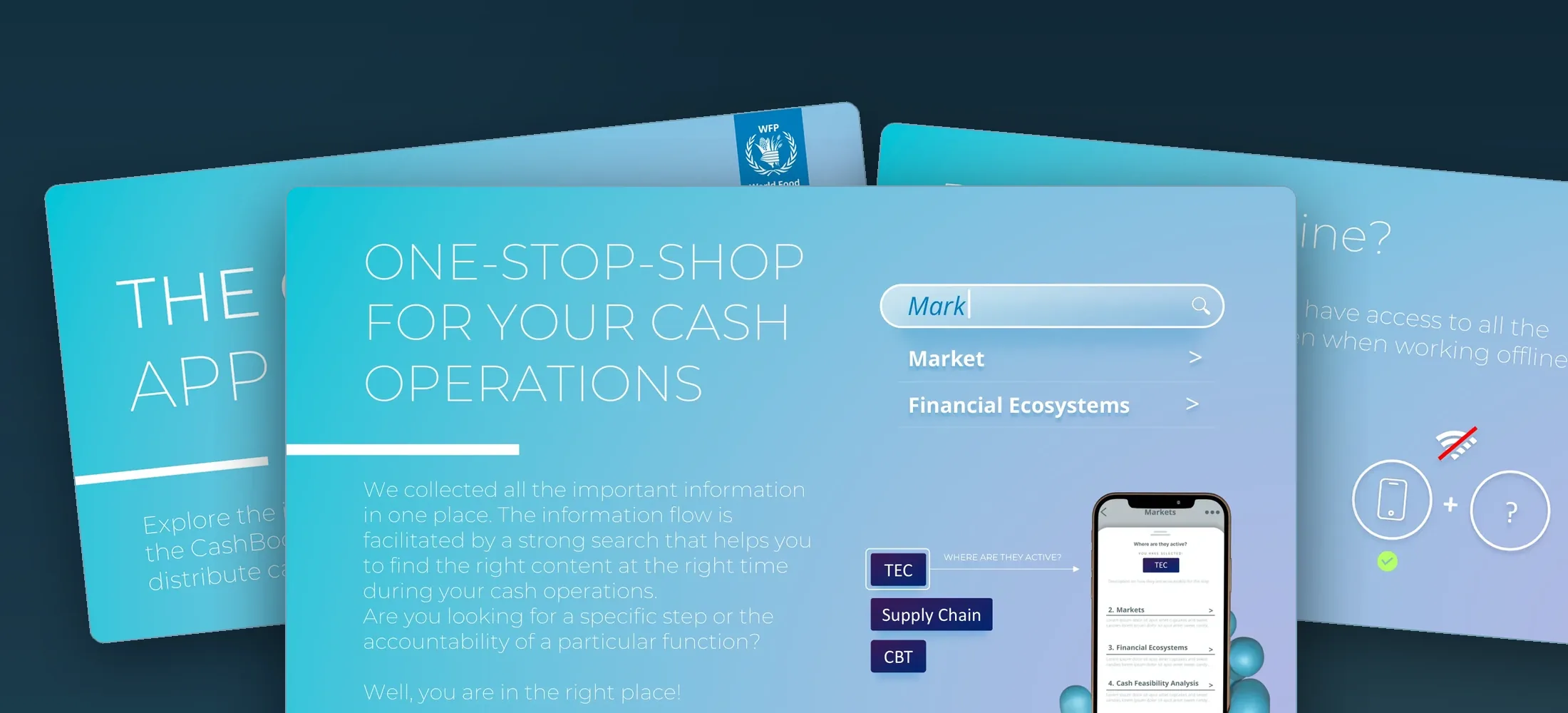
CashBook App, one-stop-shop for cash operations.
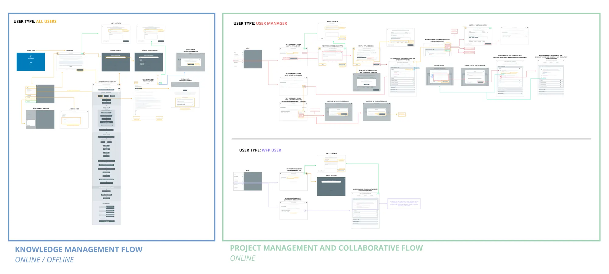
Concept and UX design of a WebApp for WFP field officers. Designed for online and offline use. Combines knowledge management with collaborative project management, built for the realities of field work.
Field officers managing cash distributions had no single, reliable tool.
WFP cash operations require managing complex knowledge (processes, guidelines, responsibilities) and collaborative project tracking simultaneously. Officers worked across scattered documents, emails, and SharePoint folders, often in low-connectivity environments. The CashBook concept was designed to bring everything into one place.
Knowledge management
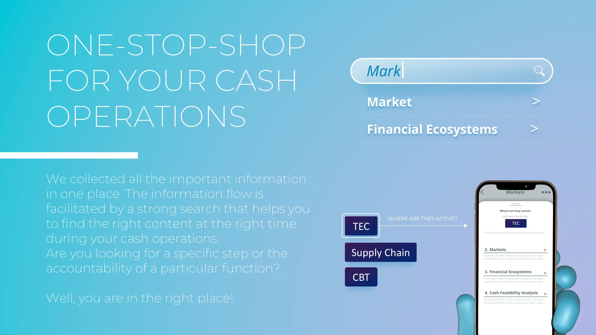
All process steps, responsibilities, and guidelines in one searchable place. Designed to work offline for field use.
Project management
Create collaborative programmes, assign team members, track outputs step by step with checklist workspaces.
Built-in audit trail
Mandatory outputs for programme audit, designed to be automatically collected and stored in a private SharePoint folder per programme.
Key design decisions
Three decisions that defined the product.
1
Offline-first architecture
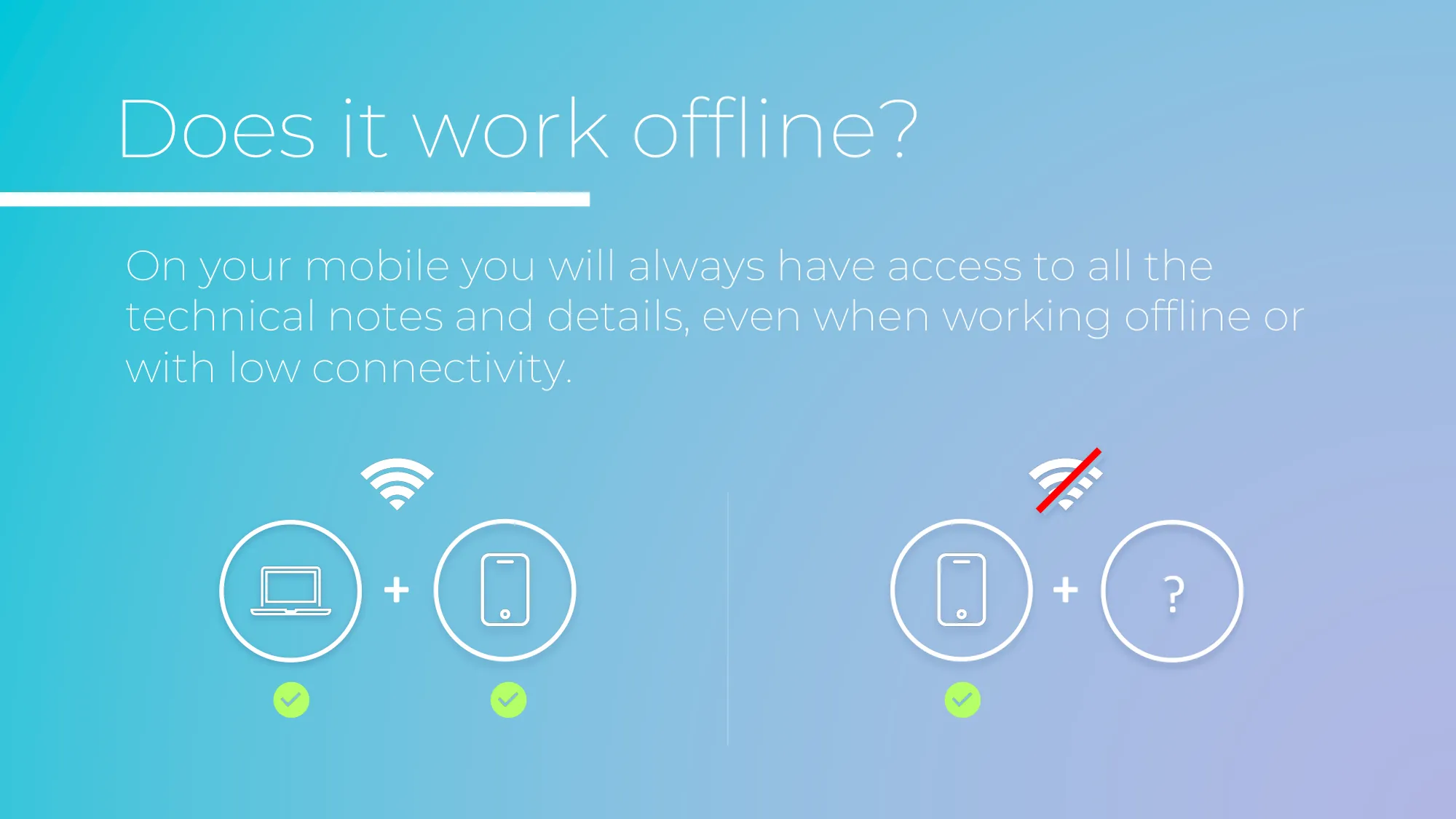
Field officers work in low or no connectivity. The knowledge management flow is designed to work fully offline on mobile and to sync with the online workspace when reconnected. This was the core technical constraint that shaped the entire IA.
Offline mobileOnline desktopSync on reconnect
2
Two flows, one app
Knowledge management (read-only, offline-capable) and project management (collaborative, online) required separate interaction models but needed to feel like one coherent tool. The desktop mapping documents both flows clearly with 3 distinct user types and permissions.
2 flows3 user typesPermission model
3
Audit compliance as UX
Every programme has mandatory audit outputs. Instead of making compliance a burden, the app integrates it into the normal workflow, officers check off outputs as they complete them, and a private SharePoint folder would be auto-generated with all required documents.
Browse knowledge base, all CBT steps and responsibilities
Search across guidelines and technical notes
Save favourites and share pages via email PDF
Works offline on mobile
Manager
Programme Lead / Country Officer
Create and manage collaborative programmes
Invite team members and assign roles
Mark sections complete and archive programmes
Full audit trail visibility
From the concept deck
How the idea was pitched.
Desktop mappingknowledge + project flows, 3 user types · scroll, click to zoom
The concept in one sentence
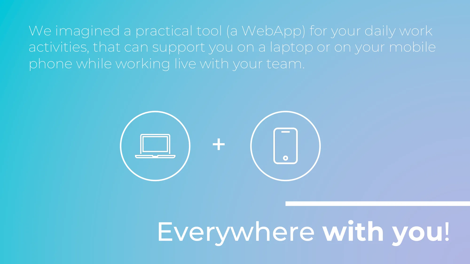
"A practical tool for your daily work activities that can support you on a laptop or on your mobile phone while working live with your team."
Placeholder“
A short testimonial from the people behind this project will appear here.
··
Full name
WFP Country Office colleague
View legacy work
Prada, TIM, Ferrero, and more.
All legacy work
Reply · Prada · Art Direction + UX/UI Design · 2017
Prada.com, the digital flagship.
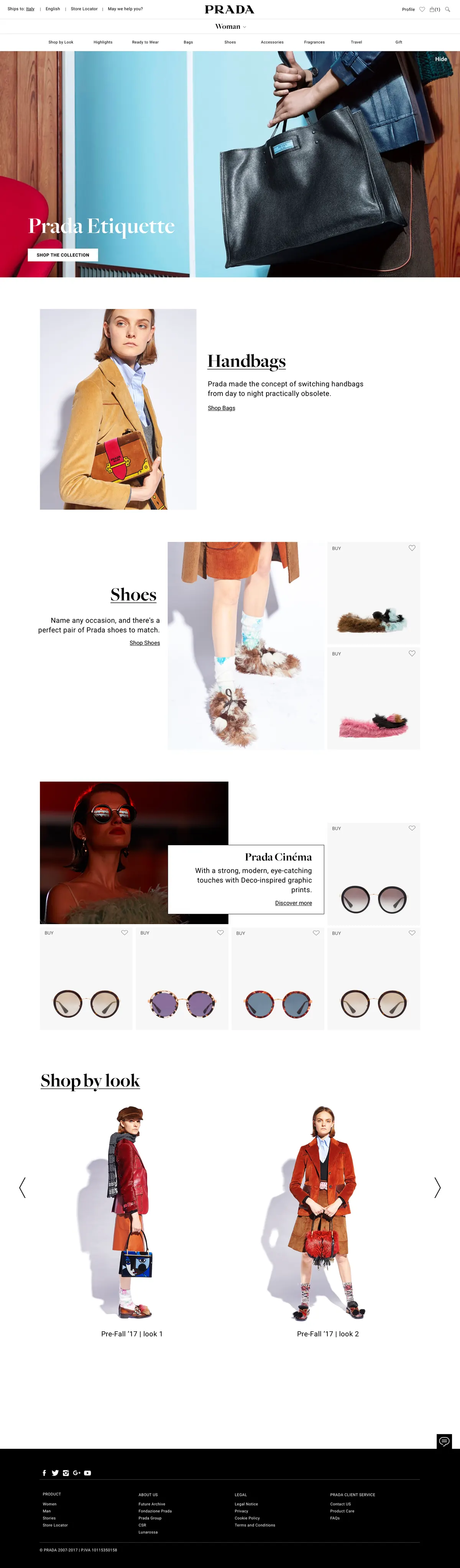
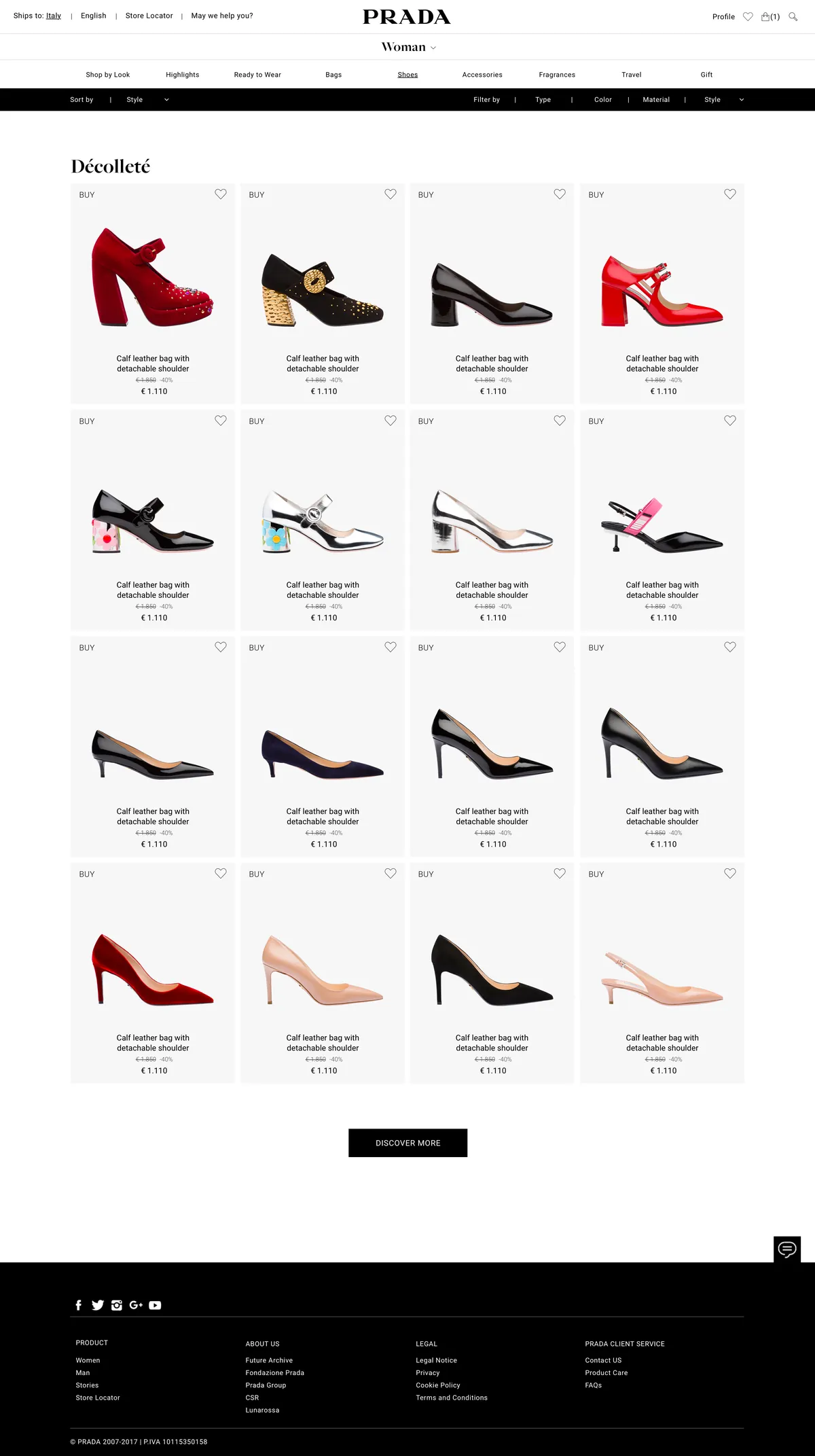
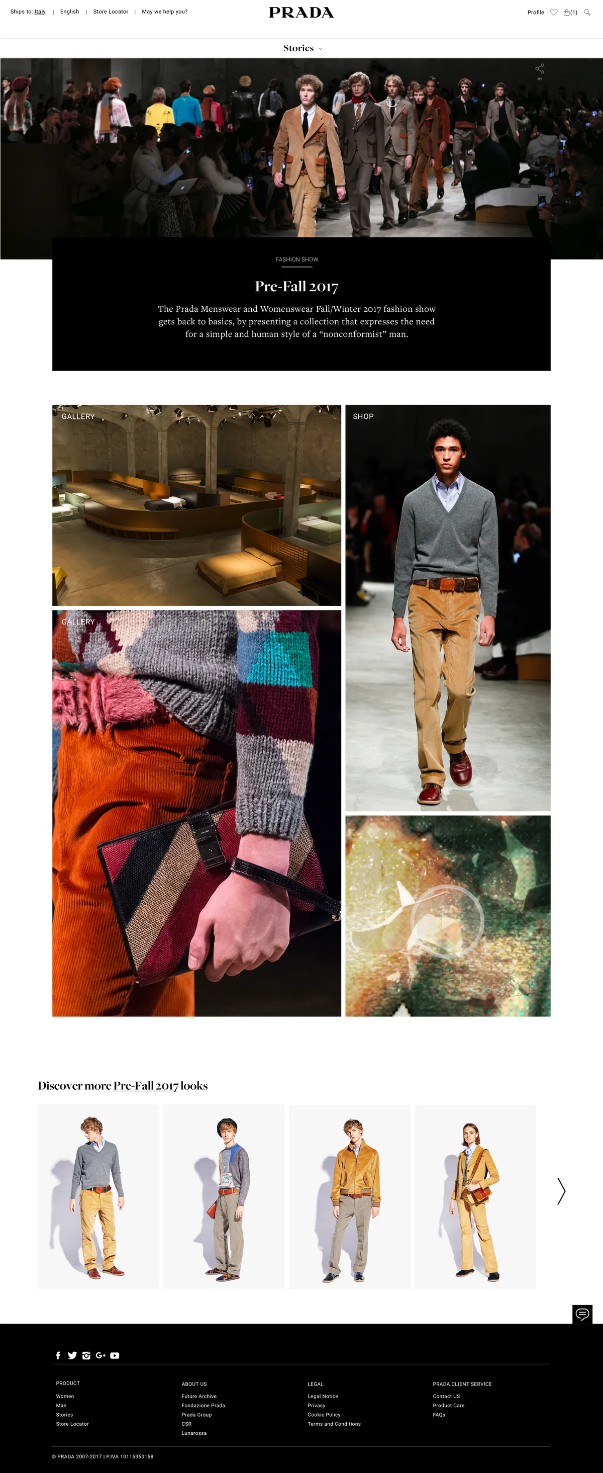
Art direction and UX/UI design for the relaunch of Prada's global e-commerce on IBM WebSphere Commerce: one template system covering the whole journey, from editorial storytelling to product, checkout and a personal Wardrobe, designed for desktop and mobile across the Global and China builds.
Art DirectionUX/UI DesignE-commerceTemplate SystemLuxury
Role
UX/UI Designer & Art Direction, Reply
Client
Prada
Platform
IBM WebSphere Commerce
Scope
Desktop + mobile · Global + China builds
230+
final page designs
28
page template families
2
market builds Global + China
2
devices, desktop and mobile
The challenge
Editorial soul, e-commerce spine.
Prada's site had to read like the house, not like a shop. The redesign merged runway storytelling with a rigorous commerce system: one family of 28 page templates for the entire journey, coherent across desktop, mobile and two market builds.
01 · Editorial meets commerce
Every story is shoppable
Fashion shows, campaigns and Stories flow straight into product: Shop by Look, Total Look pages and look carousels turn the runway into a journey that ends in the bag.
02 · One system, every page
28 template families, L01 to L28
Login, navigation, category, product, checkout, profile, store locator: each page belongs to a mapped template family, so the experience never loses coherence.
03 · Beyond the funnel
From e-commerce to the boutique
A personal Wardrobe ("What I own / What I desire") and in-boutique appointment booking connect the digital flagship to the physical maison.
The UX beneath the surface
One journey, mapped template by template.
The redesign started from an AS-IS mapping of the existing site, then rebuilt the experience as a system: every page belongs to one of 28 numbered template families, each serving a precise stage of the journey. The architecture below is reconstructed from the delivered design files, L01 to L28.
Search, shopping bag, checkout, orders and returns
L12 · L15–L19
Own
Wardrobe, profile, agenda and store locator
Plus access and support families: login, reset, FAQs, legal (L01–L02, L25–L28)Every screen in this case study belongs to one of these stages
Three flows carried the strategy
01 · The editorial funnel
From runway to bag
Every story, show and campaign can end in a purchase without ever feeling like a shop.
Runway look→Shop by Look→Product→Bag
02 · Frictionless checkout
Guest or account, three steps
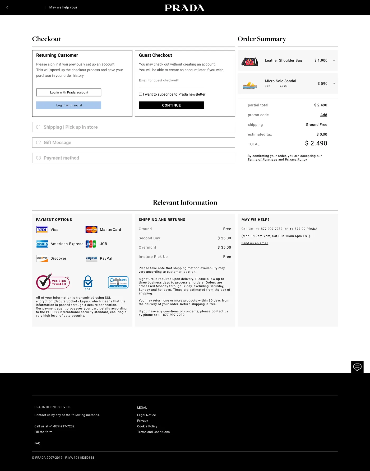
Checkout welcomes guests without an account and resolves in three numbered steps.
Guest / account→Shipping→Gift→Payment
03 · The ownership loop
From wishlist to the maison
The Wardrobe separates desire from ownership, and hands both to a personal shopper in boutique.
What I desire→What I own→Boutique appointment
The screens, desktop
From story to checkout.
Five moments of the shipped design, as delivered. Scroll the strip sideways, hover a mockup and scroll to browse the full page inside it, or click to open it in the viewer.
CategoryEditorial category, Shop by Look
Product listingThe e-commerce engine
StoriesRunway into content
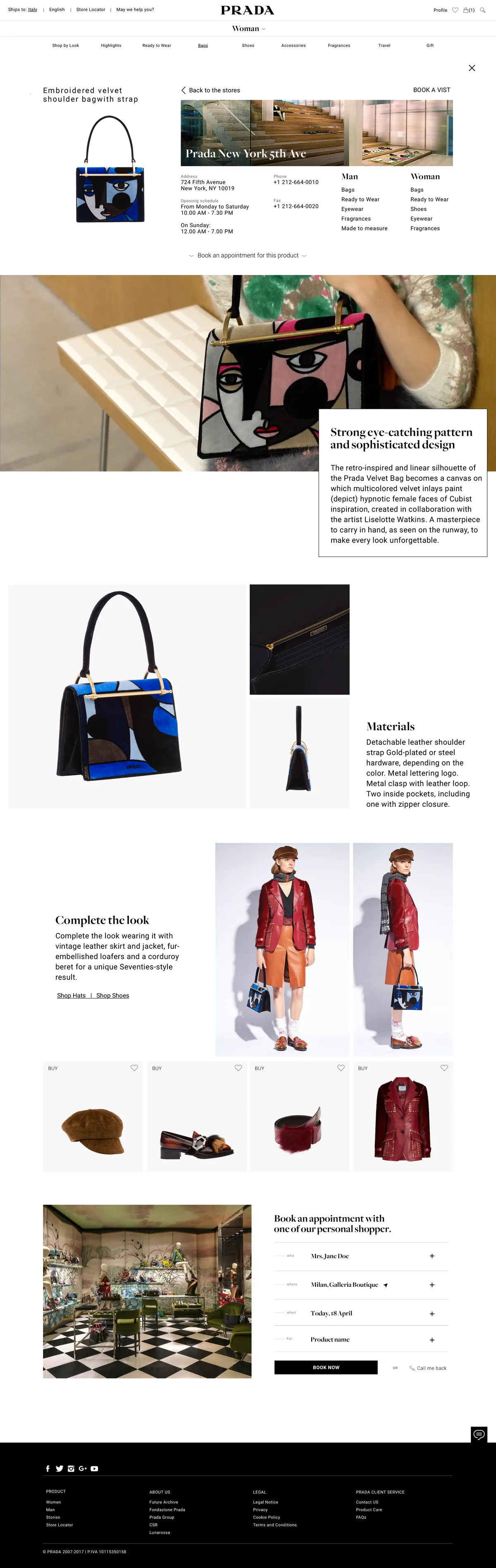
Product pageCraft, story, boutique
CheckoutGuest or account, three steps
Scroll, drag or use the arrows to explore →
Attribution. Work produced in my role at Reply for Prada. Screens show the interface design as delivered.
Mobile
The same couture, in one hand.
Every template was designed for mobile as a first-class citizen: the homepage editorial flow, the personal Wardrobe and the build-your-look experience.
Mobile homepage
Personal Wardrobe
Build your look
From design to development
Documented to be built.
A design only counts if engineering can build it. Alongside the screens, the hand-off included functional documentation mapping behaviours, states and rules template by template, the working reference for the WebSphere development team.
Functional documentation
Behaviours, interaction states and business rules mapped for each template family
Delivered in successive drops alongside the UI, evolving with the build
The day-to-day reference for the development team through to launch
Confidential. The functional documentation remains with the client and can't be shown here.
In numbers
One design language, the whole journey.
230+
final page designs delivered
28
template families L01 to L28
2
market builds Global + China
1
journey, from story to checkout
Placeholder“
A short testimonial from the people behind this project will appear here.
··
Full name
E-commerce team · Prada
More legacy work
Prada, TIM, Ferrero, and more.
All legacy work
Reply · Ferrero · UX/UI Design · 2016–2018
Magic Kinder, play, designed with care.
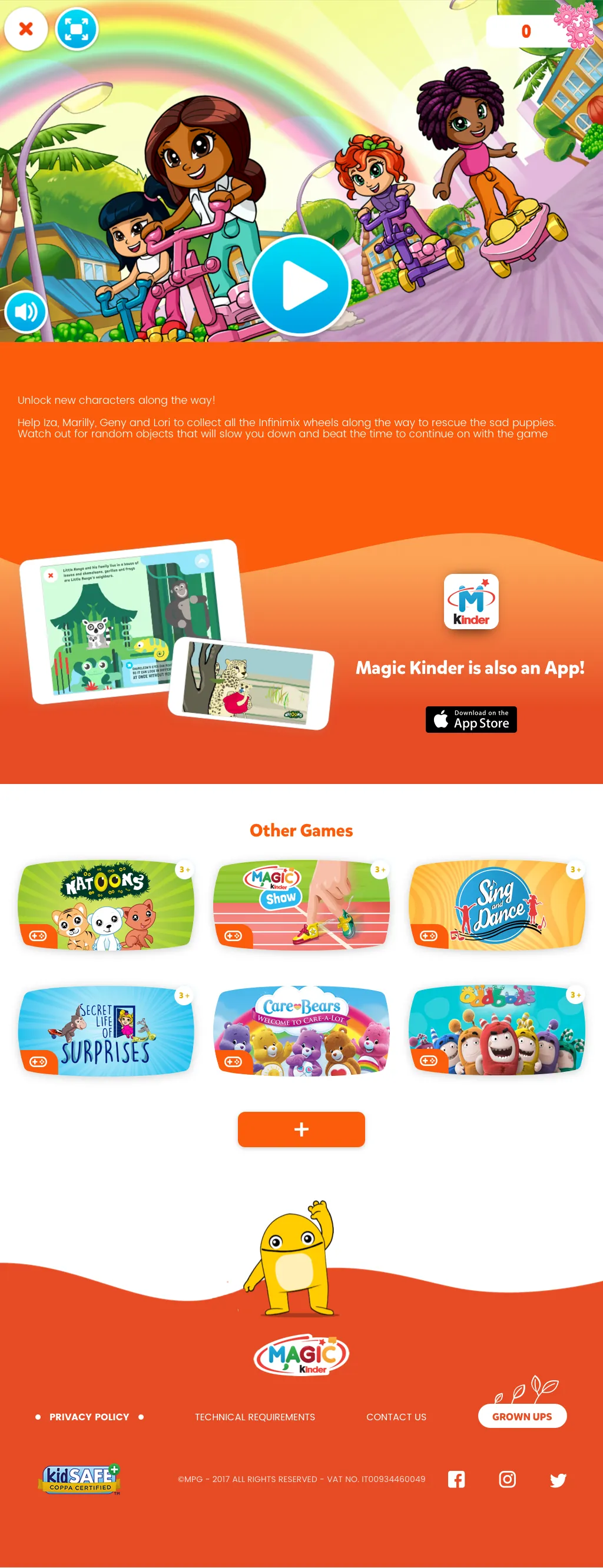
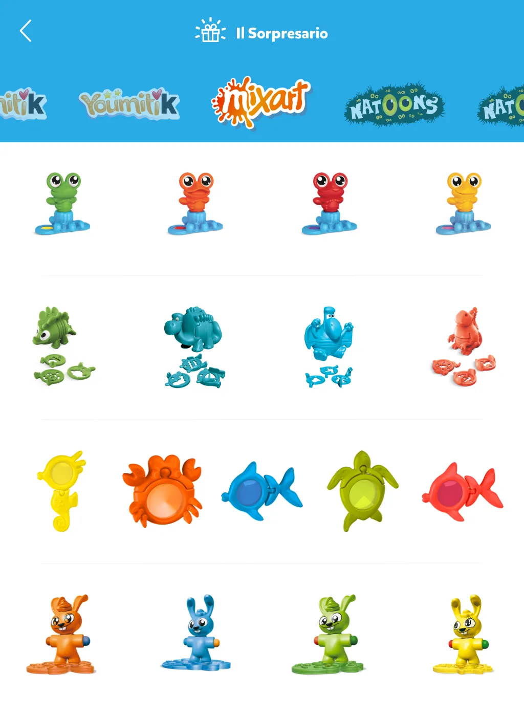
UX/UI design for Ferrero's Magic Kinder ecosystem: the kids' content Hub app and the mobile site, where children find games, videos and stories with licensed characters, parents keep control from a protected area, and the surprise toys live on in a digital Sorpresario.
UX/UI DesignKids & FamilyApp + Mobile SiteLicensed IPskidSAFE COPPA
Role
UX/UI Designer, Reply
Client
Ferrero, Magic Kinder
Products
Hub app (tablet + smartphone) · mobile site
Safety
Age-gated · parent area · kidSAFE COPPA certified
2
products, one universe
1,700+
design files delivered
8
languages, store-ready
4
content worlds, games to surprises
The challenge
Design for kids, answer to parents.
A product for children is really two products: a world a 3-year-old can navigate alone, and a system their parents can trust. Magic Kinder had to do both, while honouring a catalogue of licensed characters and refreshing itself with the seasons.
01 · Kid-first interaction
No reading required
Big targets, characters as landmarks, colour-coded worlds and age badges (3+, 5+, 7+) let children explore games, videos and stories on their own.
02 · Parents in control
A protected grown-up area
A locked parent space with tips, expert content and settings, age gates at entry, and kidSAFE COPPA certification across the ecosystem.
03 · A licensed universe
Many brands, one language
Care Bears, Oddbods, Natoons and seasonal themes each keep their identity inside one coherent Magic Kinder design system.
The screens
Games, videos, stories, surprises.
The Hub app and the mobile site share one universe. Scroll the strip sideways, browse inside each mockup, click to zoom.
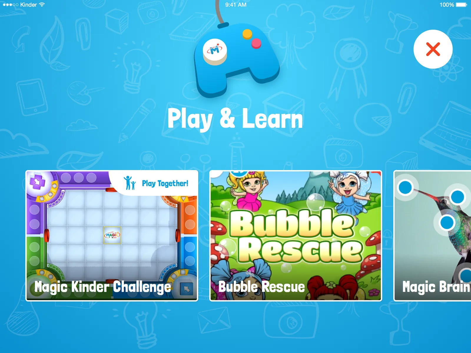
Hub · Play & LearnGames gallery, play together
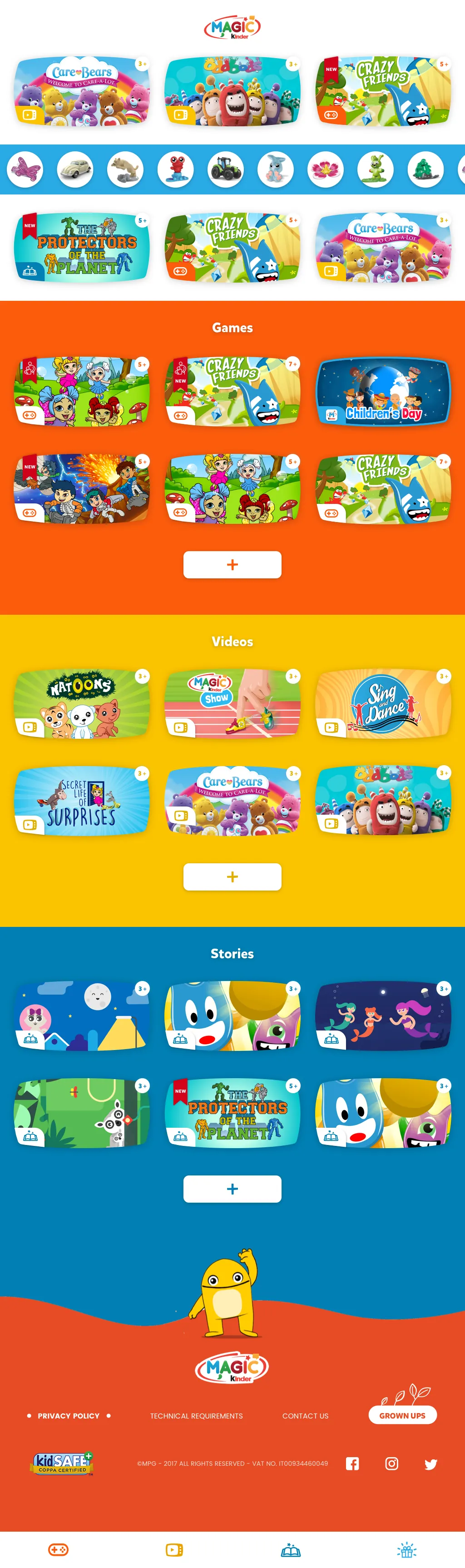
Mobile site · HomeGames, videos and stories worlds
Mobile site · Game detailPlay, then discover more
Il SorpresarioThe surprise toys, digital
Scroll, drag or use the arrows to explore →
Attribution. Work produced in my role at Reply for Ferrero. Screens show the interface design as delivered; licensed characters belong to their respective owners.
Mobile
The same worlds, in a kid's pocket.
The mobile site brings the full universe to any phone: content worlds by colour, story and video detail pages, and the app always one tap away.
Mobile home
Story detail
Video player
In numbers
A universe children can roam, safely.
kidSAFE
COPPA certified, safety built in
3+
age-banded content, 3+, 5+ and 7+
Seasonal
themes refresh the app through the year
1
design language, app, site and seasons
More legacy work
Prada, TIM, and more.
All legacy work
Reply · TIM (Telecom Italia) · UX/UI Design · 2016–2017
TIMmusic, a shared identity made for music.
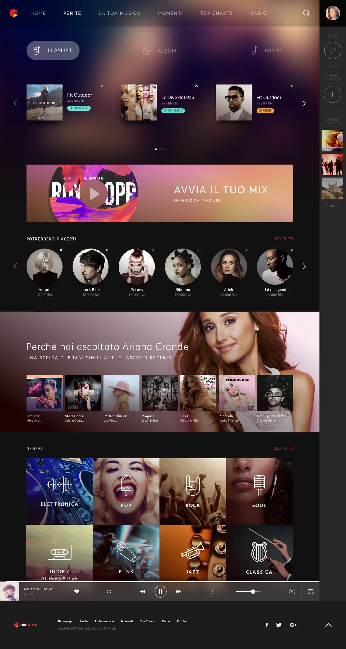
TIM was unifying the look of its entertainment services, TIMvision, TIMmusic, TIMgames and TIMreading, under one visual concept. My work: take that shared identity and make it carry a full streaming product, from editorial storytelling to playlists, radio and recommendations, across web, iOS and Android.
A shared corporate concept is a gift and a cage: it guarantees family resemblance, but it was never designed around album art, playlists and a player that never leaves the screen. TIMmusic had to feel unmistakably TIM, and behave like a music service people use every day.
01 · The constraint
One identity, four services
The visual concept was shared with TIMvision, TIMgames and TIMreading. Music got its own declination, not its own language.
02 · The content
A catalogue, not a catalogue page
Editorial playlists and personal ones, radio, offline listening, recommendations, charts and artist pages: every surface competes for the same screen.
03 · The proof
Method, before pixels
The client's request asked for architecture and interaction thinking first, and only then a visual mockup that proved the concept could sing.
The request, answered
Three asks, three deliverables.
The client's request for information was precise about what it wanted to see. Each ask mapped to a piece of work, and each is visible in the screens below.
Ask 01 · Architecture
First and second level information architecture. Twelve sections, from onboarding and search to charts, genres, artists and the personal library, with a persistent right rail for saving, creating and reaching your playlists from anywhere.
Ask 02 · Interactions
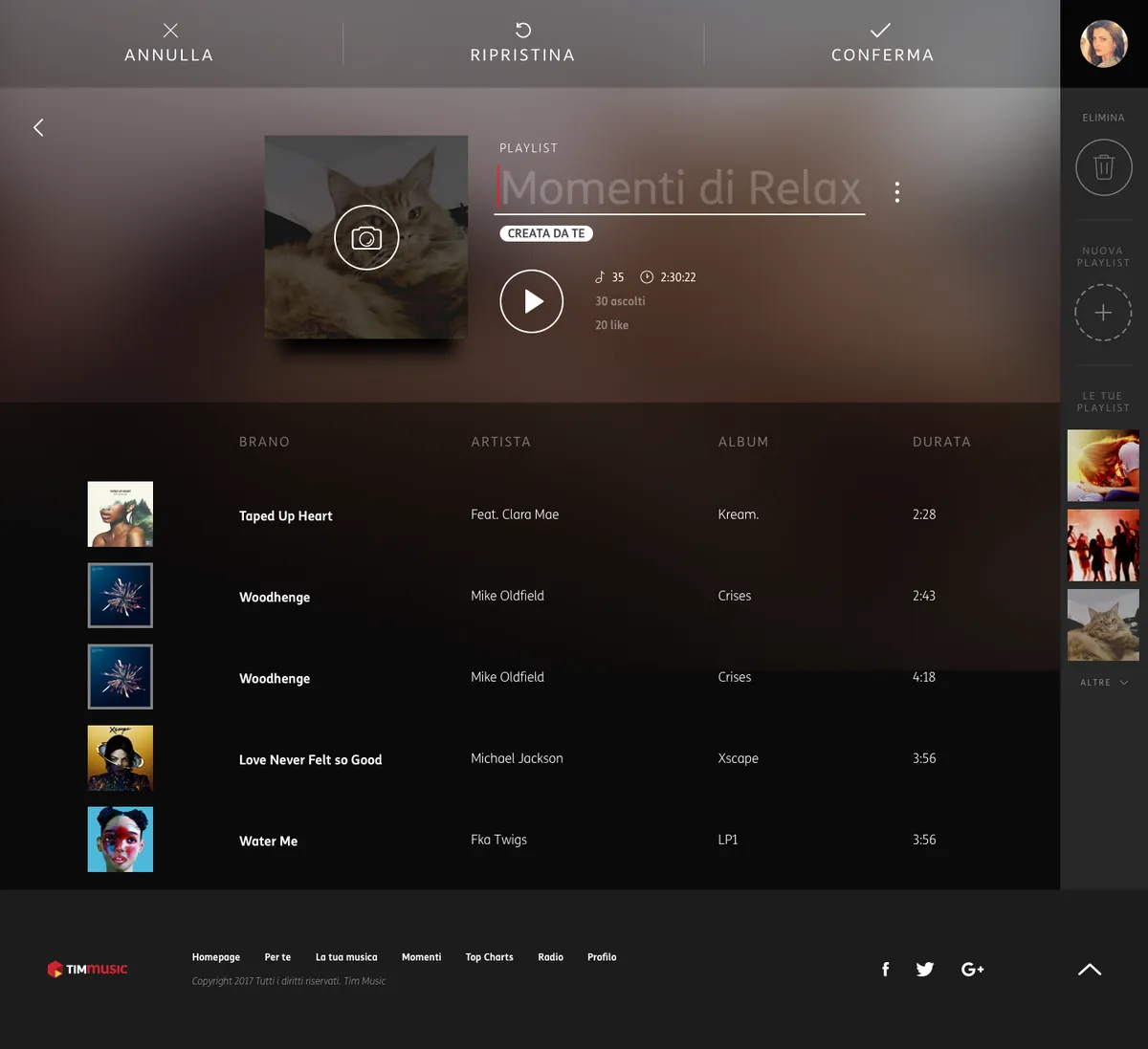
Wireframes for creating a playlist and editing the listening queue. The two moments where a streaming service either feels effortless or falls apart, designed as an inline edit mode with undo, restore and confirm.
Ask 03 · Visual proof
A mockup that creates a playlist and plays a track. Delivered as a full-fidelity design where cover art drives the palette of the page and the player stays docked while you browse.
Confidential. The client's brief is an internal document and can't be shown here; only what it asked for is described.
The design
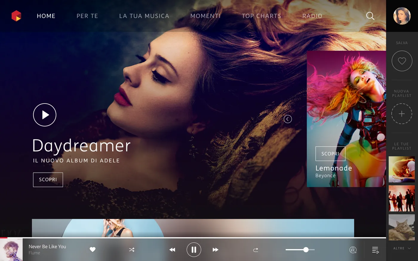
Let the artwork light the room.
Full-bleed artwork, type that steps back, and a player that stays with you: the home screen with a track playing. Click to zoom.
Home, playingThe player never leaves
The screens
From discovery to your own playlist.
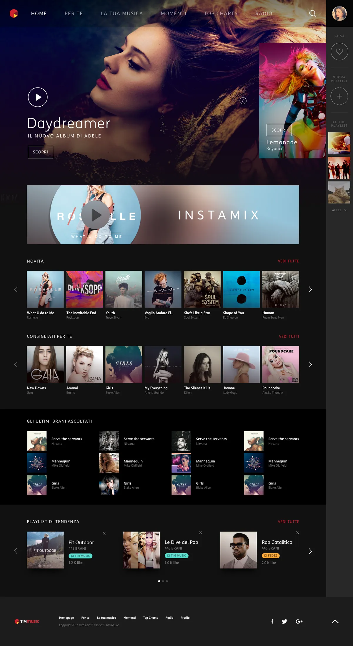
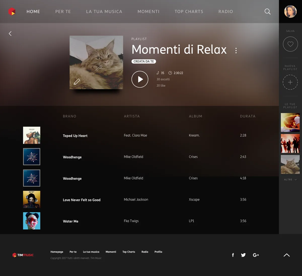
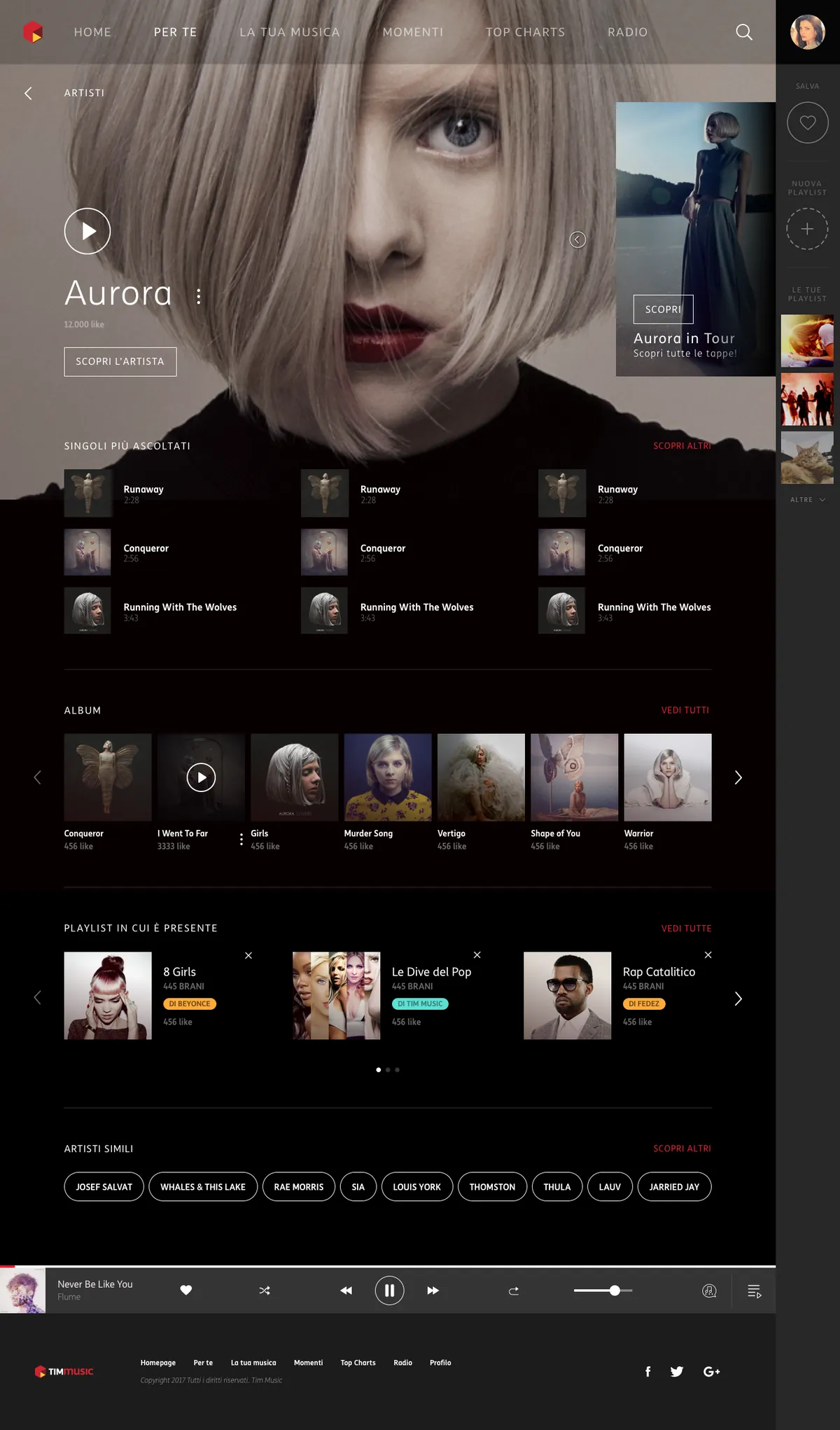
Five moments of the delivered design. Scroll the strip sideways, browse inside each mockup, click to zoom.
HomeEditorial first, catalogue below
Per TeRecommendations with a reason
Your playlistMade by you, coloured by you
Edit modeUndo, restore, confirm
ArtistTop tracks, albums, related
Scroll, drag or use the arrows to explore →
Attribution. Work produced in my role at Reply for TIM. Screens show the interface design as delivered; artists, artwork and figures are placeholder content from the design files.
A web app about cytomegalovirus, a common virus that is harmless to most people and dangerous in pregnancy. It has to inform without frightening: prevention in plain language for anyone who lands on it, and a code-protected private area with a weekly calculator, a shared agenda and the nearest testing centres for the women following a monitoring programme.
Anyone informing themselves · women in a monitoring programme
Delivered
Architecture · UI design · custom icon set · front-end
2
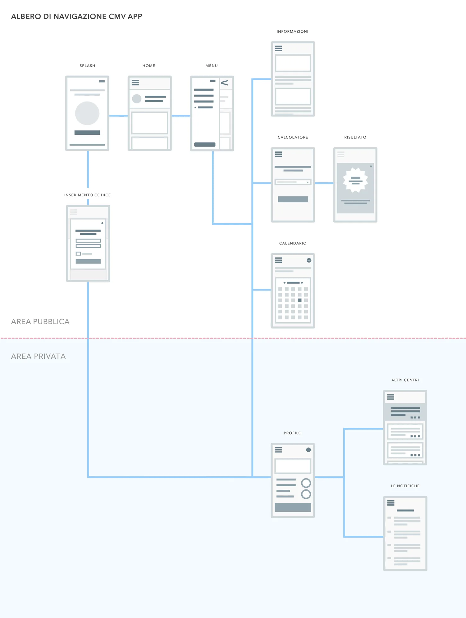
areas, public and protected
10
screens mapped end to end
3
tools, calculator agenda, centres
1
code opens the private side
The challenge
Say "virus" without saying "panic".
Health content has a default tone: clinical, dense, frightening. For an audience of pregnant women looking up a virus that can harm a baby, that tone is the fastest way to lose them. The app had to be warm enough to read and precise enough to trust, and to serve two very different visitors from the same front door.
01 · Tone
A friendly face for a scary word
An illustrated character, soft coral gradients and short plain sentences turn "cytomegalovirus" into something you can actually read while worried.
02 · Two visitors
One door, two journeys
Anyone can read prevention information freely. Women in a monitoring programme enter a code and unlock a private space built around their weeks.
03 · Usefulness
Beyond the leaflet
A weekly calculator, an agenda for appointments and the nearest testing centres, with distance, phone and email one tap away.
The architecture
Where the private side begins.
The navigation tree that set the product: everything above the dotted line is open to anyone, everything below it needs a code. Drawing that line first is what kept the public side generous and the private side focused. Click to zoom.
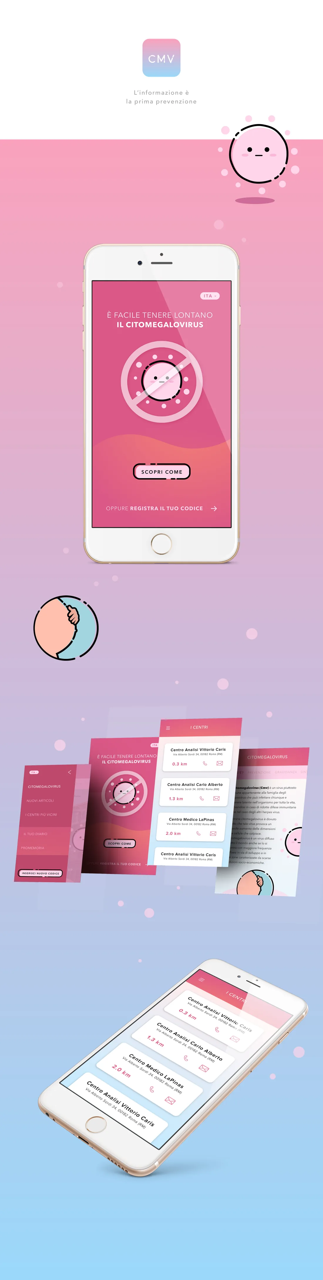
The design
Coral, not clinical.
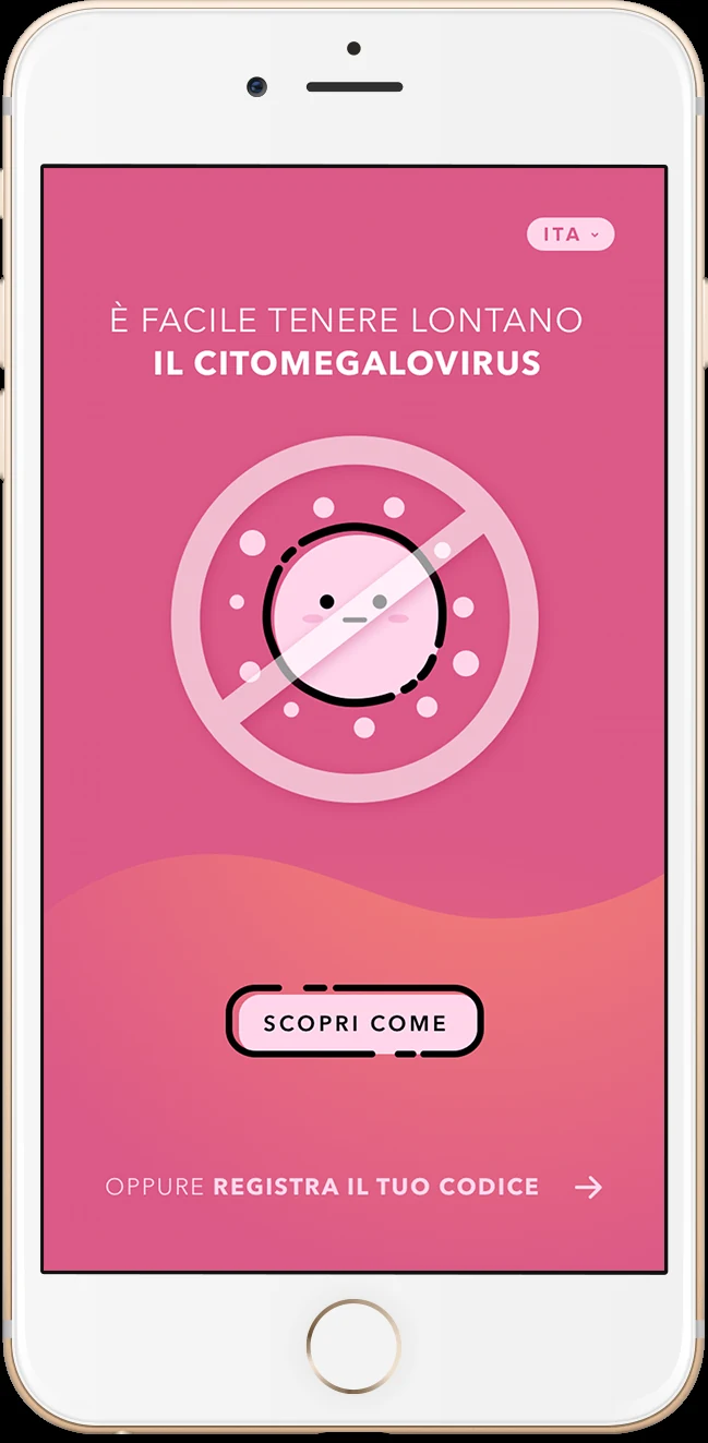
The delivered design: entry screen, menu, information pages and the nearby centres list, with a custom icon set drawn for the app. Scroll inside the board, click either image to zoom.
Entry screen
Attribution. Work produced in my role at Reply. Centre names, addresses and codes shown are placeholder data; the programme documentation stays with the client.
What defined it
Prevention people actually read.
Warm
an illustrated character instead of clinical stock
Open
prevention readable without any login
Weekly
a calculator that follows the pregnancy
Nearby
testing centres, sorted by distance
More legacy work
Prada, Ferrero, TIM, and more.
All work
2011–2020 · Agencies, consulting and freelance
15 years, 20+ brands, across 6 sectors.
Before moving into humanitarian design, I worked across luxury, finance, healthcare and telecoms, leading UX and UI design at Reply and earlier agencies for clients including Prada, TIM, Luxottica and more.
Scroll, drag or use the arrows to explore →
Prada
01 / 04
Prada.com e-commerce
Art Direction · UX/UI Design · View case →
TIM
02 / 04
TIM Music
UI/UX Design · Streaming · View case →
Ferrero
03 / 04
Magic Kinder
UX/UI Design · Kids ecosystem · View case →
CMV
04 / 04
Citomegalovirus app
UI/UX Design · Healthcare · View case →
The work shown was produced in my roles at the World Food Programme and Reply, on behalf of the respective organisations and clients. All names, logos and trademarks belong to their owners and appear for portfolio purposes only.
Let's work together.
Available for senior design roles, consulting, and advisory.